Brand overhaul for an international college
Wycliffe College came to us for a complete brand overhaul – from exploration of their brand purpose through to the modernisation of their crest, and everything between.

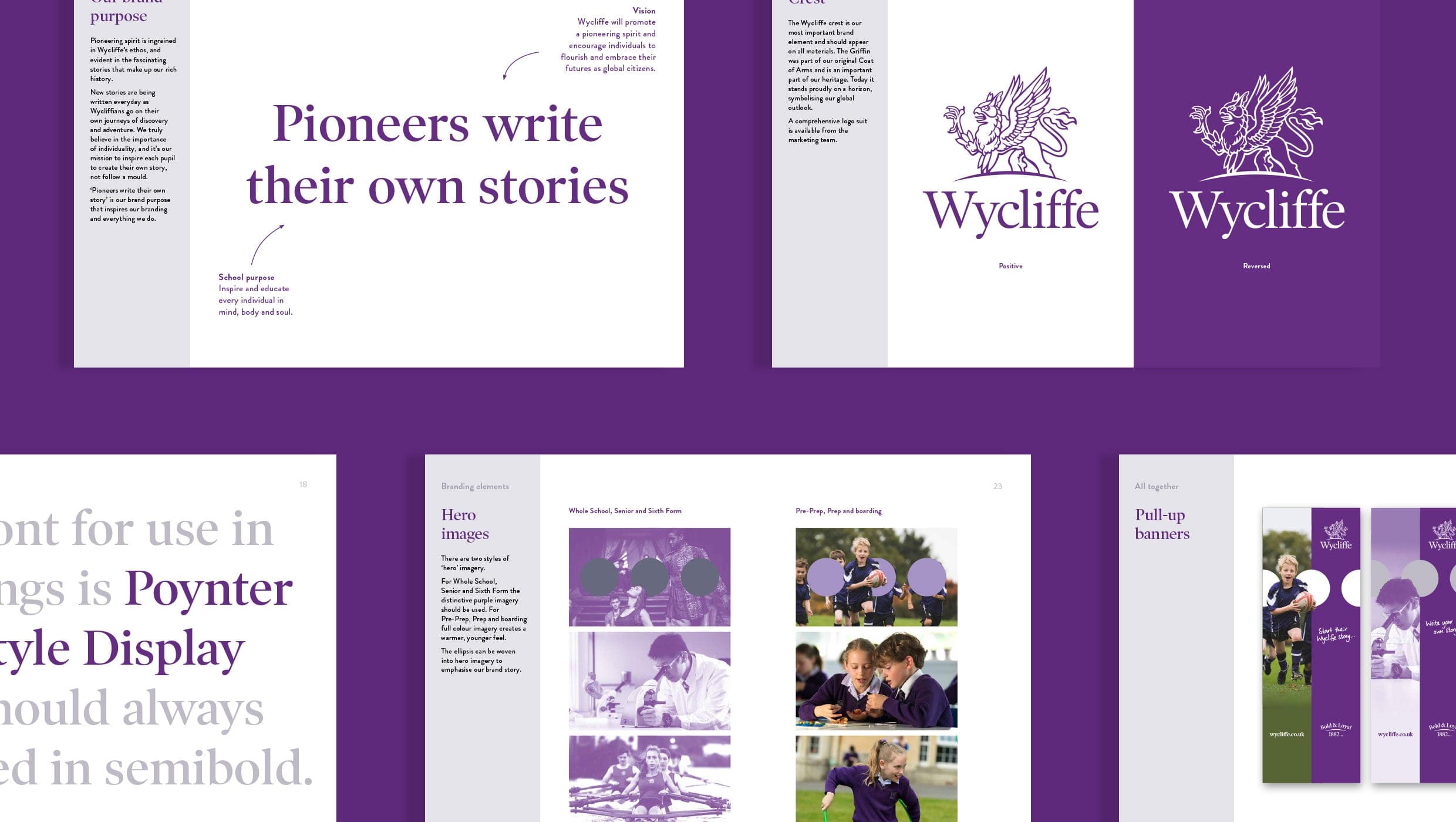
A pioneering spirit
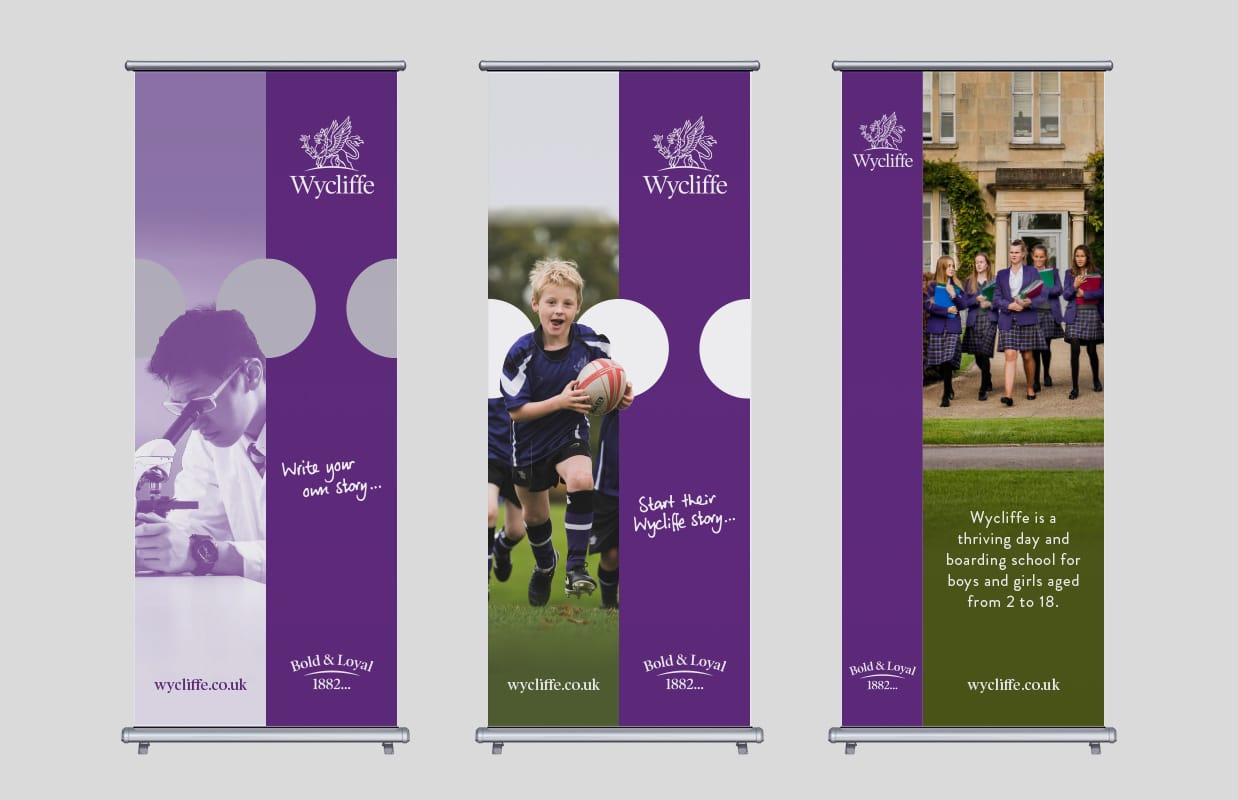
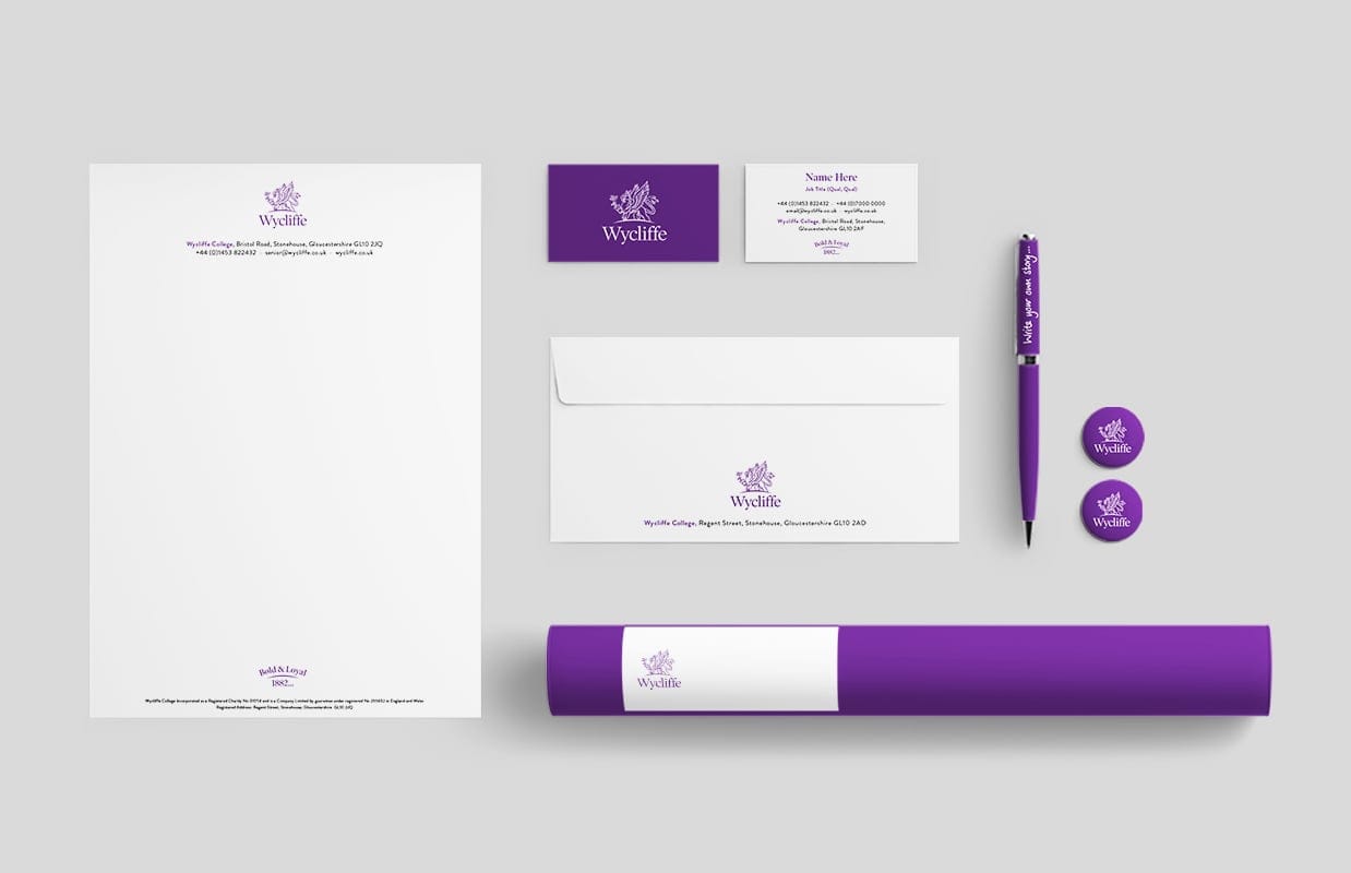
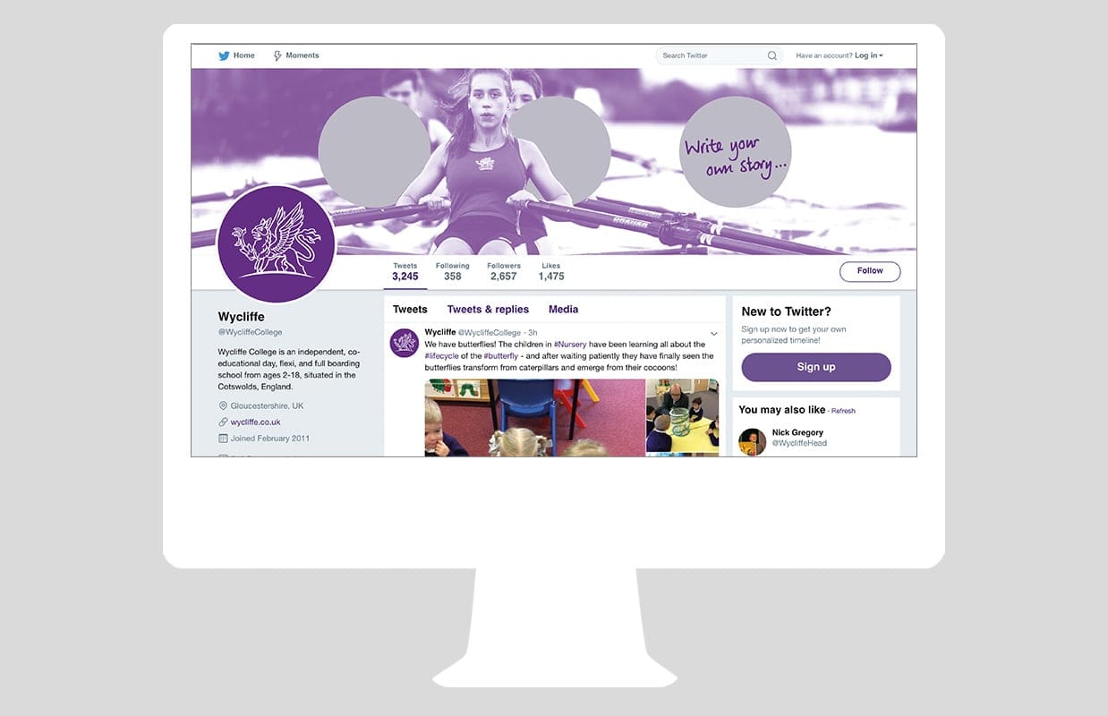
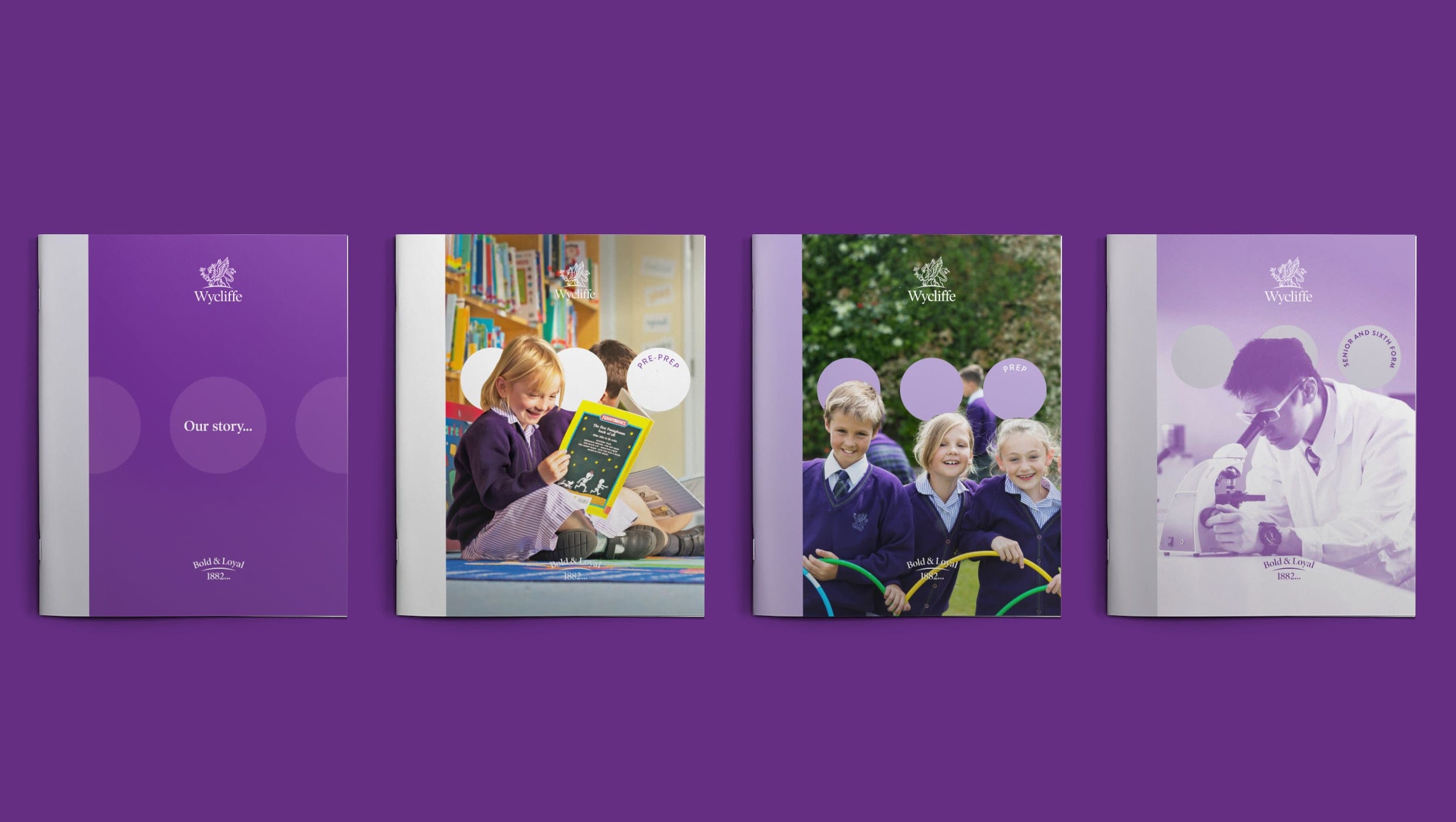
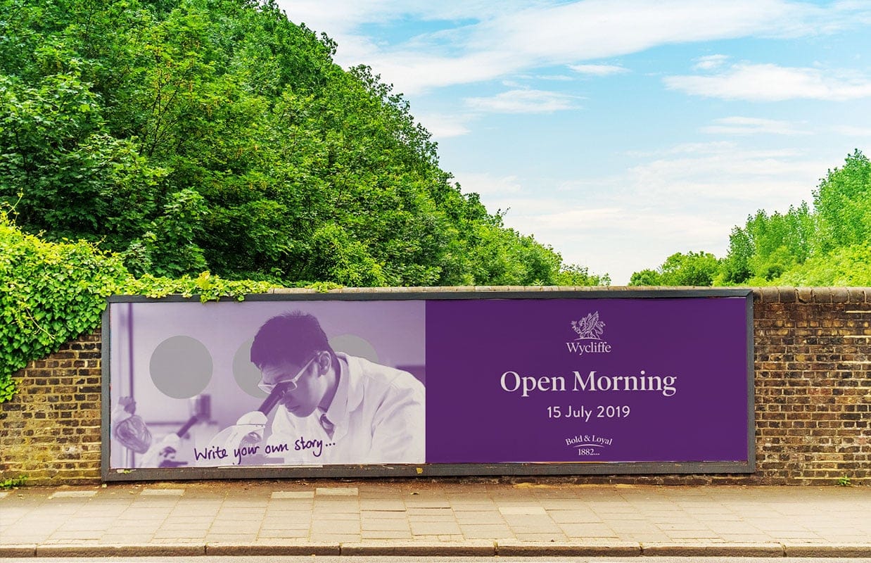
An organisation’s ethos and culture can often be traced to its past, and this was the case for Wycliffe College. Uncovering stories about the college’s early years and listening to anecdotes from today’s pupil’s, teachers and families, revealed a theme: ‘a pioneering spirit’. ‘Write your own story…’ articulates this ethos and serves as a call to action, reminding Wycliffians to always follow their own path.

The ellipsis…
We were keen for the college’s brand purpose to have a visual articulation in the identity. By making the ellipsis (…) a design element it provides a consistent link to the purpose and strapline. It creates a flexible graphical element and a way to visually convey the brand’s purpose. Combined with the purple imagery it creates a striking and distinctive look for the school.
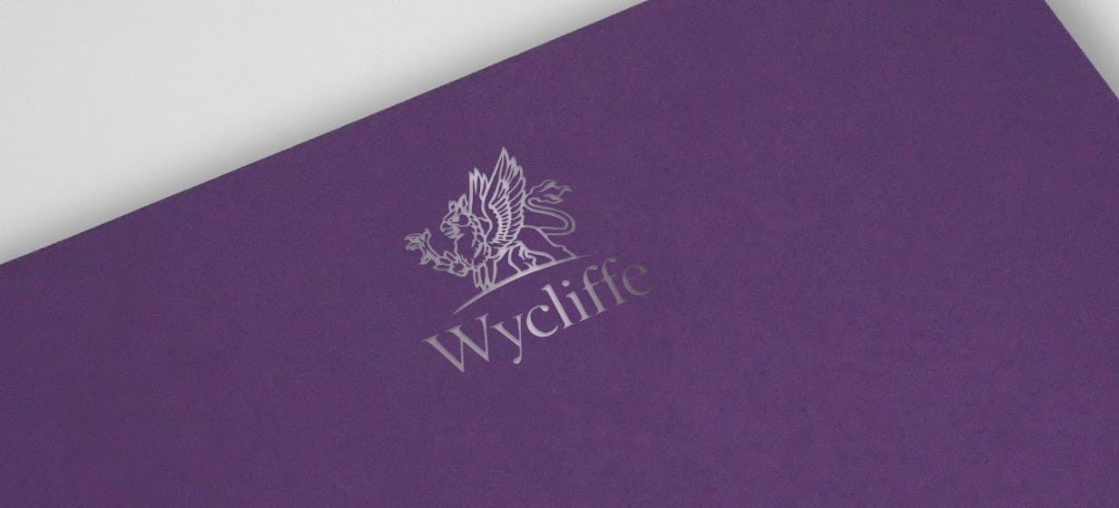
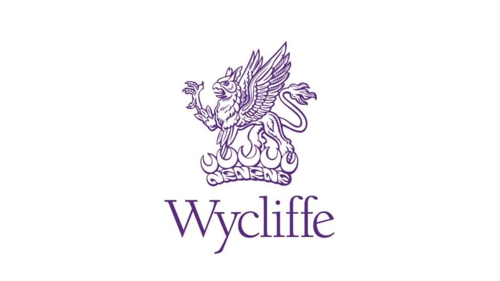
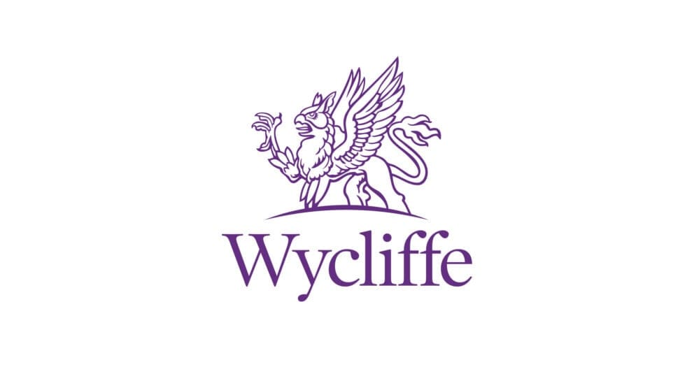
Modernising the crest
For many schools and colleges, their crest or shield is an important part of their identity, but presents a challenge in the digital age. For Wycliffe, we carefully redrew their crest, simplifying and removing detail, whilst being sympathetic to its heritage and mindful of retaining its character. As a subtle twist to represent how the college has become international, we changed the crown to a horizon.
“Working with MCC was a pleasure, they ticked every box. They were professional, extremely creative and incredibly speedy. It helped that they were able to work with all aspects of our marketing, from digital to print to merchandise – saving us a lot of time and ensuring brand consistency. I would definitely recommend them.”
Director of Marketing and Admissions, Wycliffe College