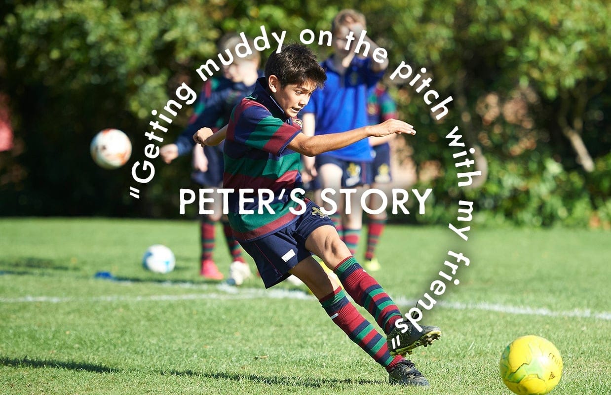
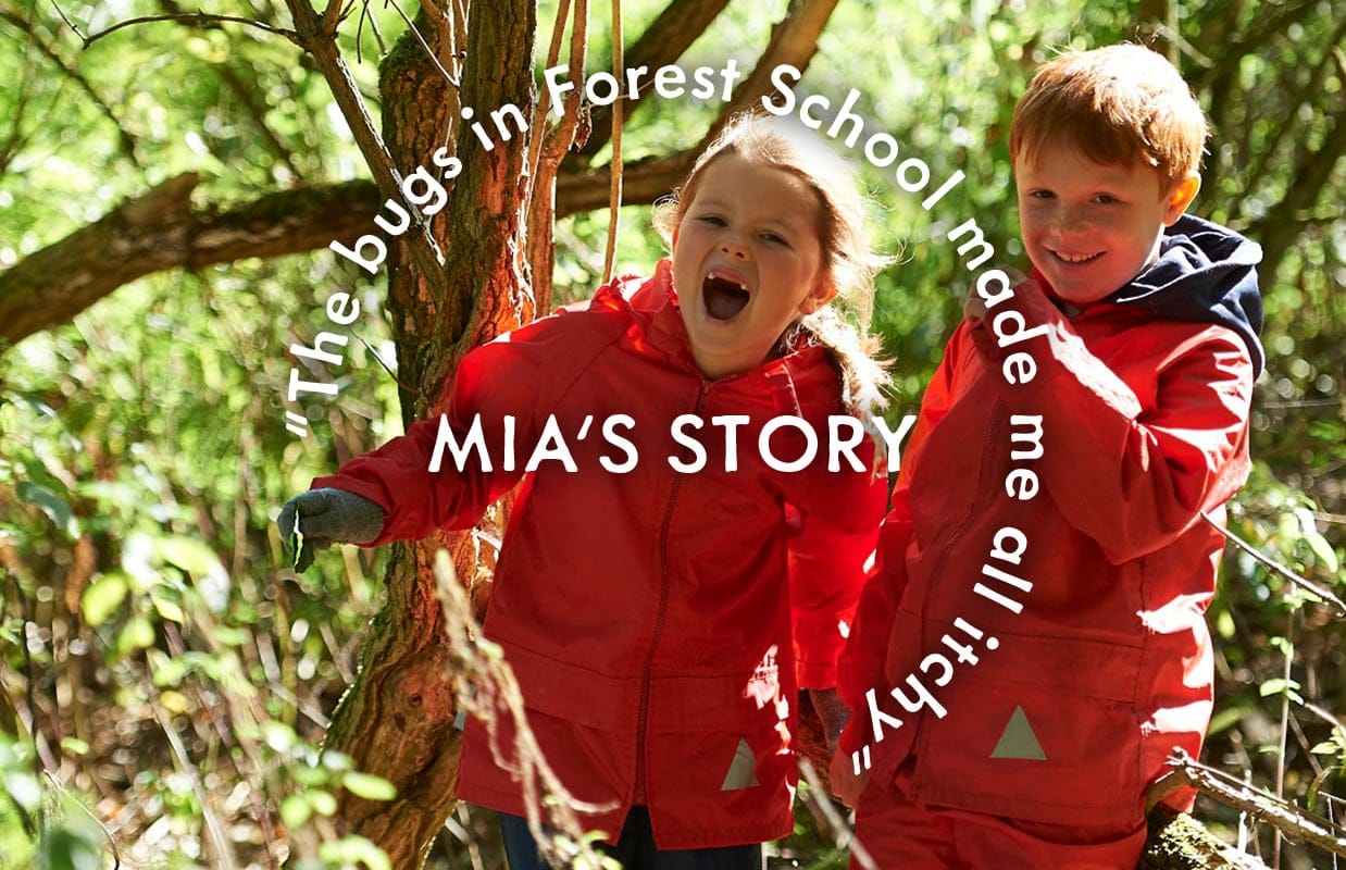
A new brand for a child-centred prep school
It goes without saying that every school is child-centred, but Beechwood Park takes it to another level – their teaching, decision-making and entire culture is focused on the individual child. Even school reports are written to the children, not the parents.
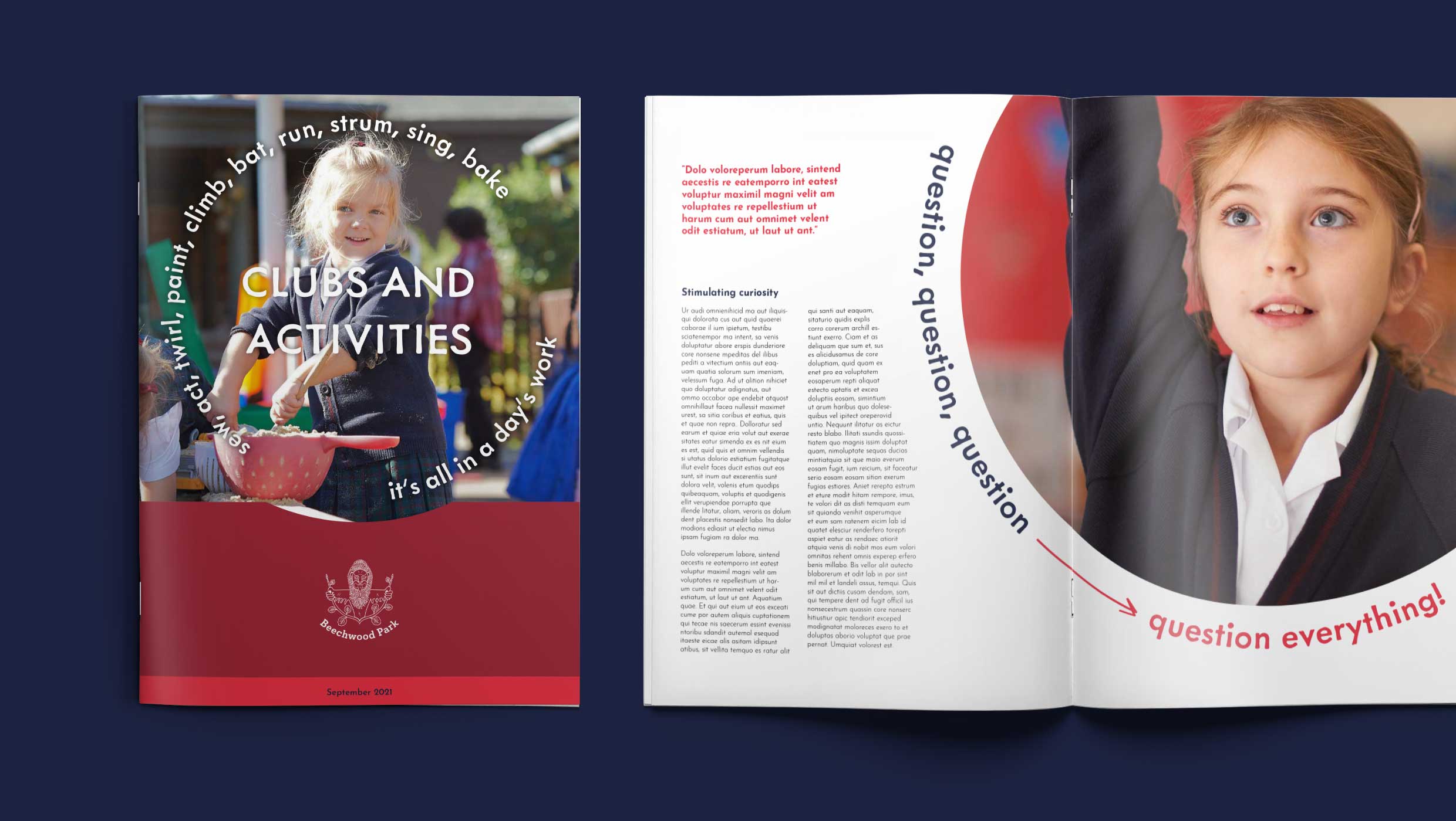
So, in rebranding the school our aim was to convey this unique, child-centred ethos.
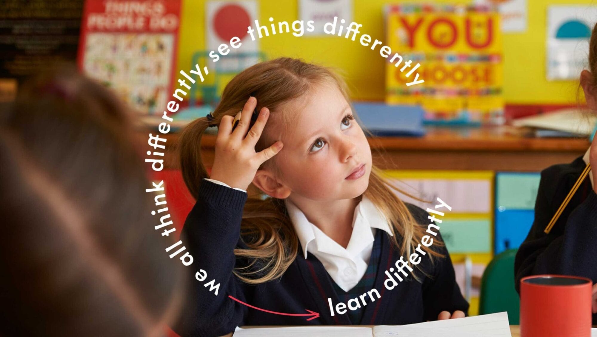
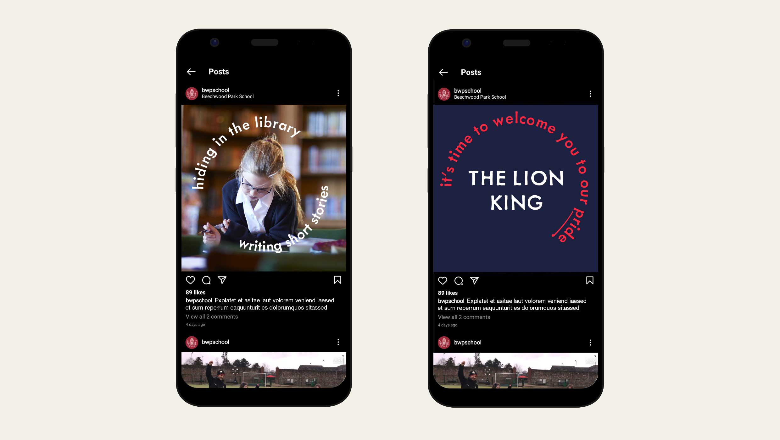
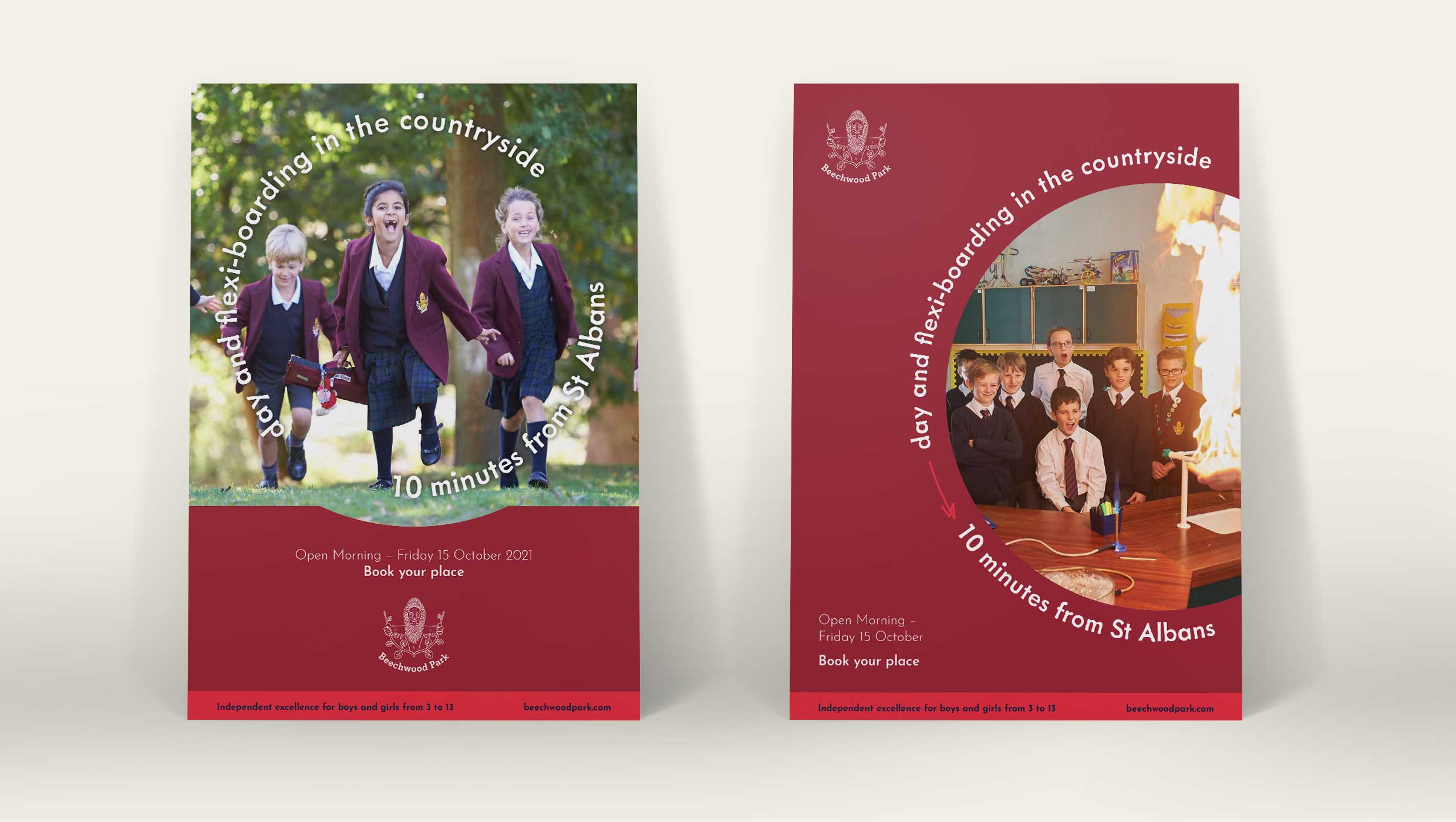
Surrounded by words
The brand narrative is integrated into the brand through curved text, visually and verbally embodying the ‘child-centred’ ethos. The tone of voice, typography and doodles make sure the brand is relevant for prep pupils whilst maintaining a professional identity.
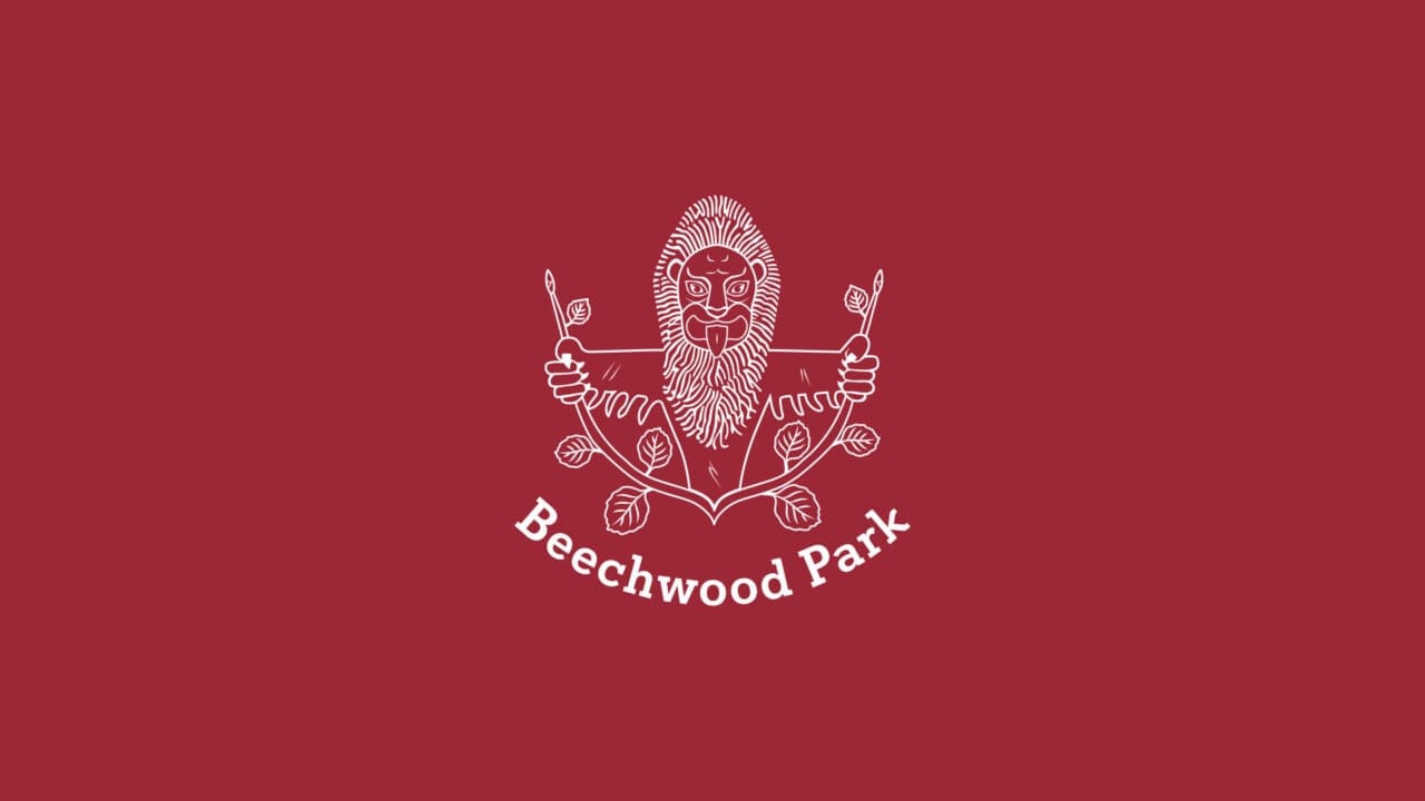
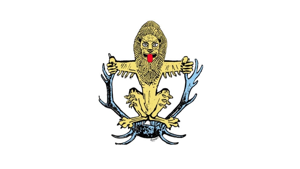
Return of the lion
The Beechwood lion dates back to the origins of the school but had been replaced by a generic tree icon a decade ago. From the start, we were keen to bring back the character and personality that the lion brings to the brand. However, an evolution was needed to make him more relevant and user-friendly today.
The antlers made way for beech tree branches (a nod to the school’s name, its surrounding and the outgoing logo) and a simpler lion was drawn from scratch. We took special care to ensure the new digital logo retained the character and some of the imperfections of the original hand-drawn artwork.
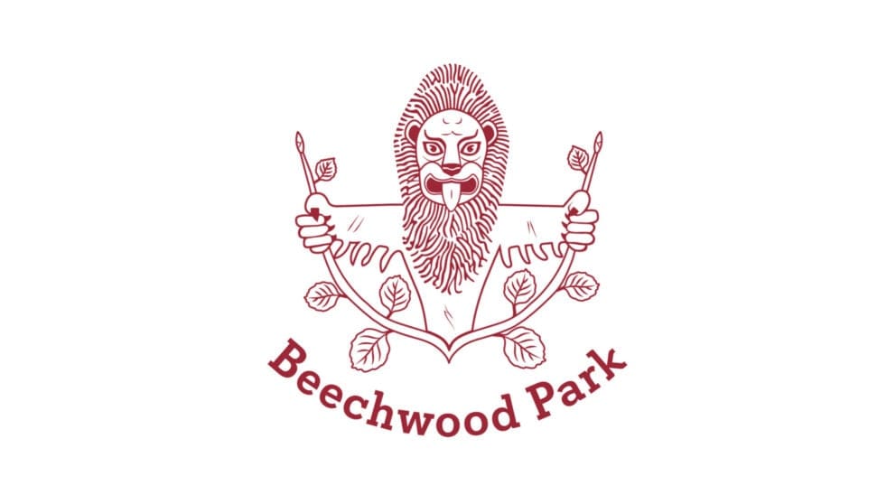
A vibrant twist
The colour palette was strengthened and modernised by tweaking the blue and maroon, and replacing gold with a bright red to provide a vibrant punch of colour.