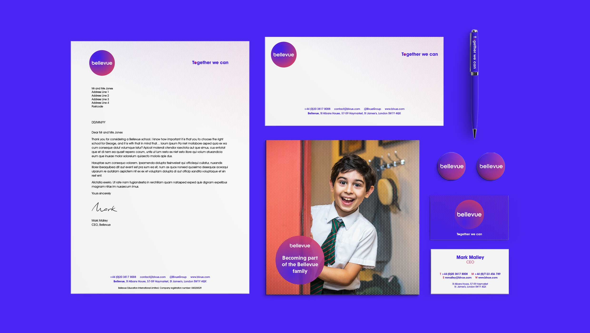
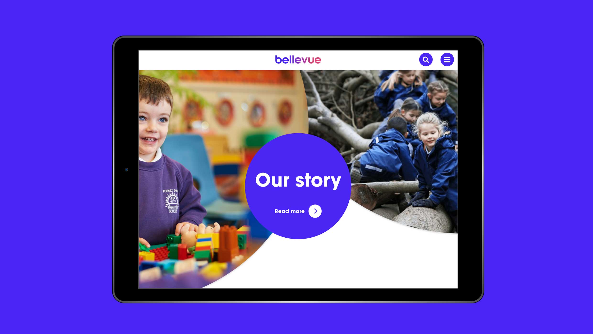
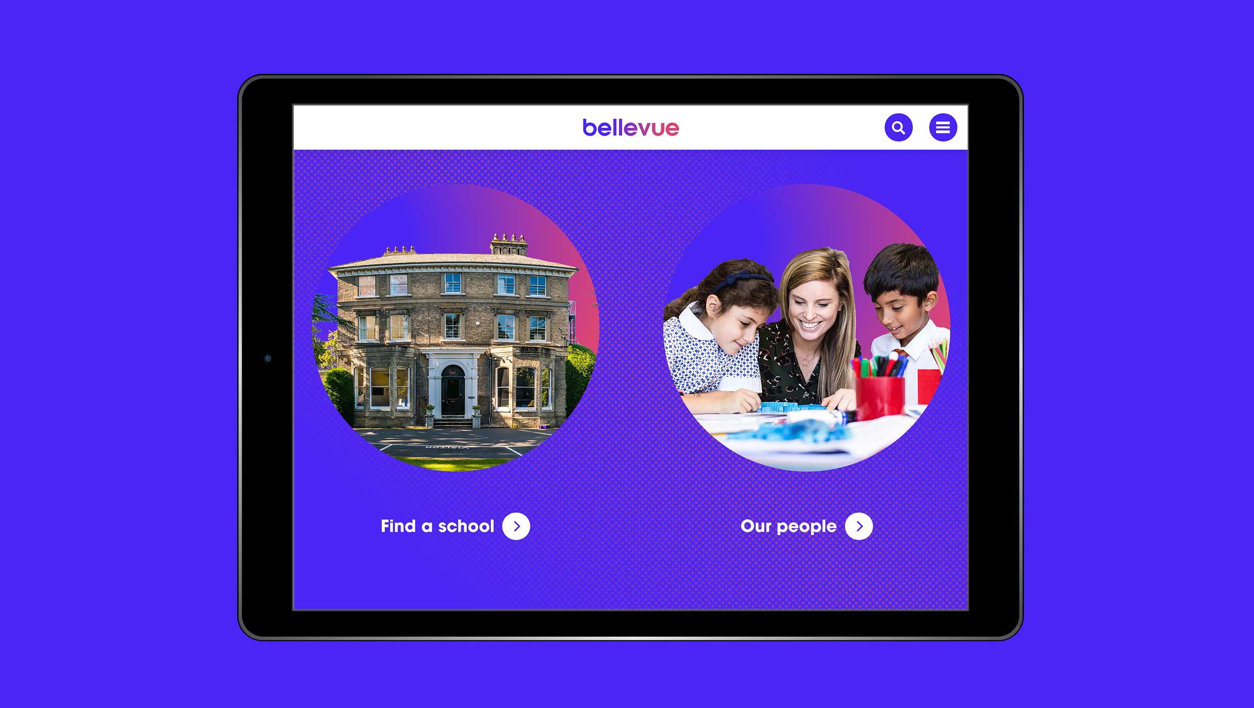
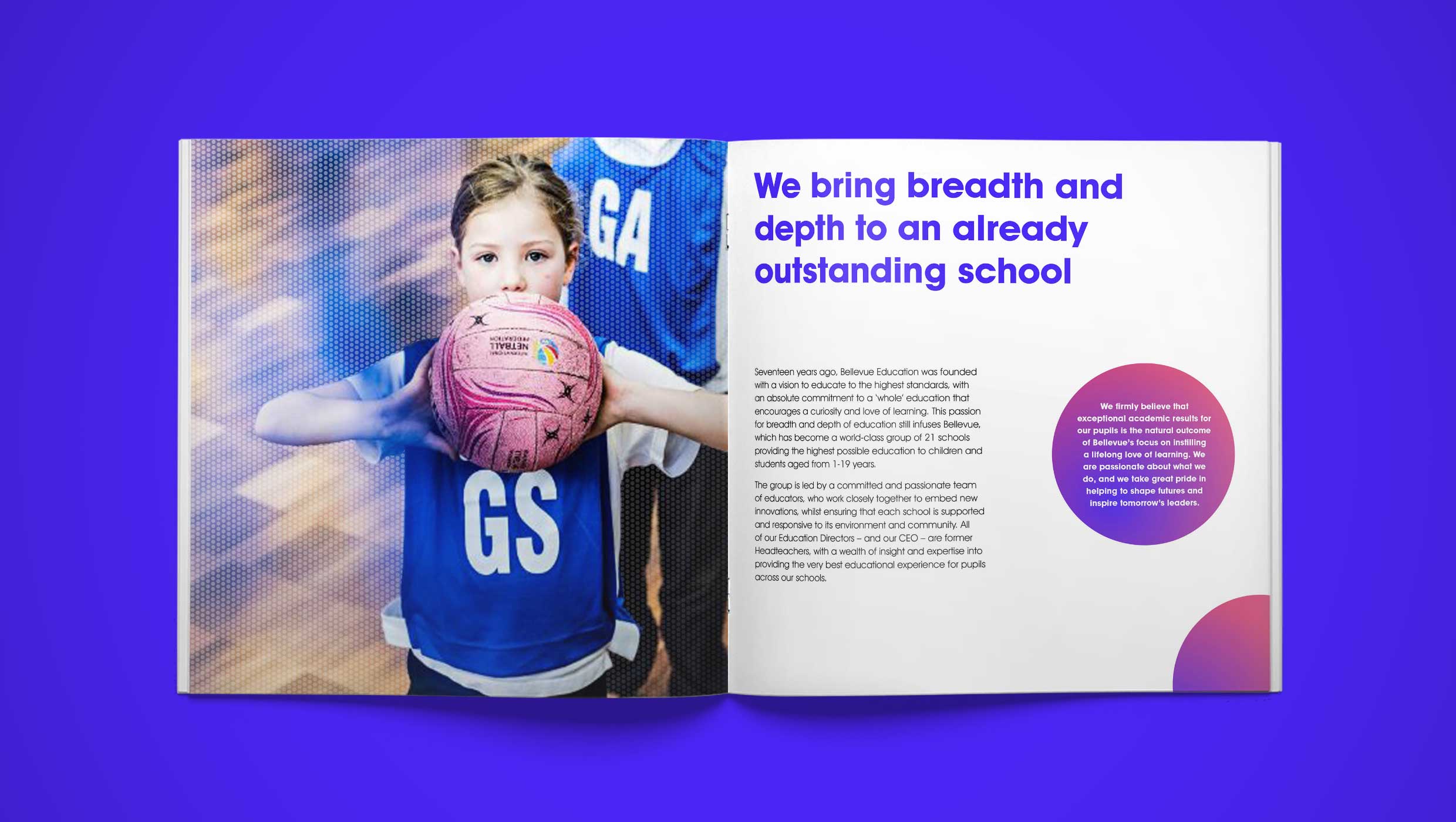
A bold new brand for Bellevue
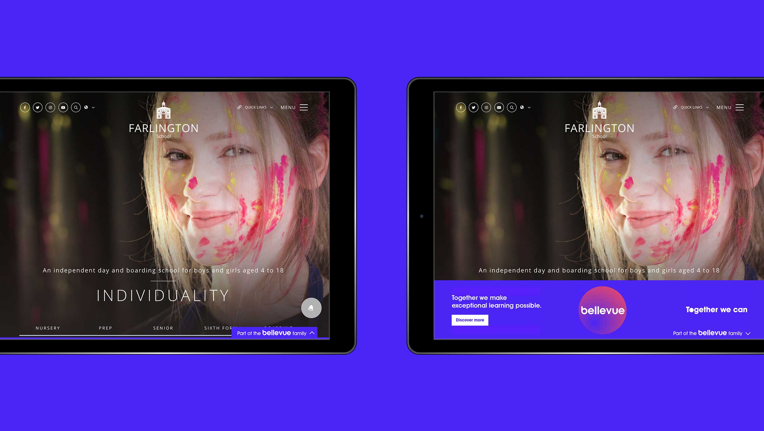
Led by a group of experienced former headteachers, Bellevue is a growing group of independent schools founded in 2003. In creating a new brand, the group wanted to find out and convey how each school and each child thrives by being part of the larger Bellevue family.
United in words
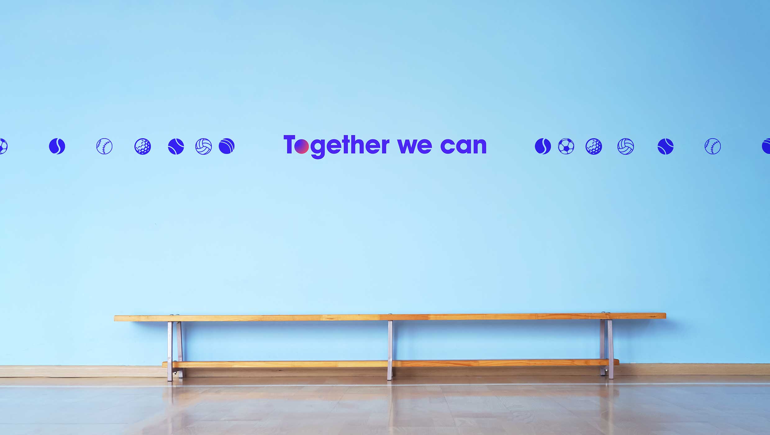
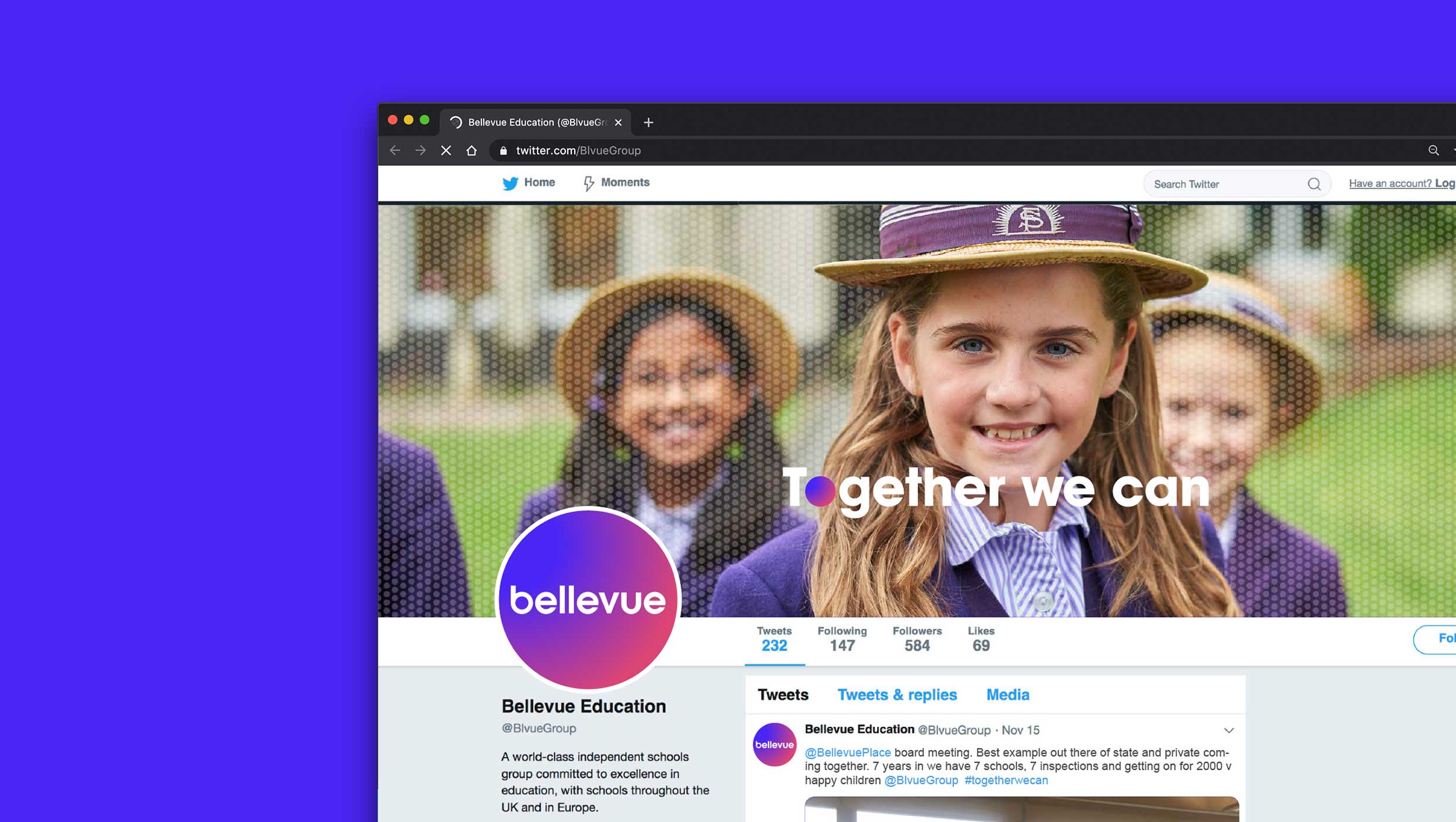
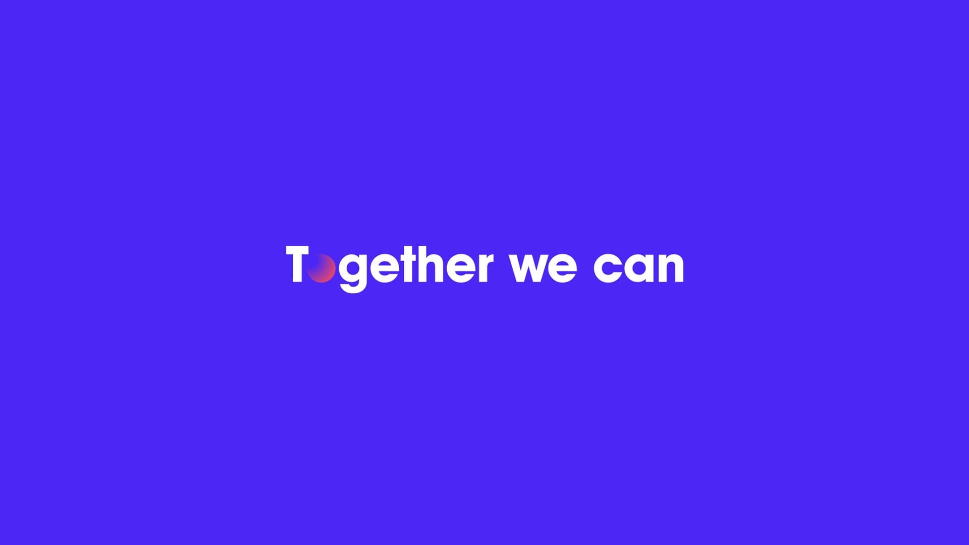
Creating a tagline that can unify and inspire pupils, staff and families across the group was a key element of the rebranding. It became clear, the deeper we dug, that being part of a larger family creates opportunities and removes barriers for everyone. From this discovery, the brand strapline – Together we can – was born.
From bland to bold
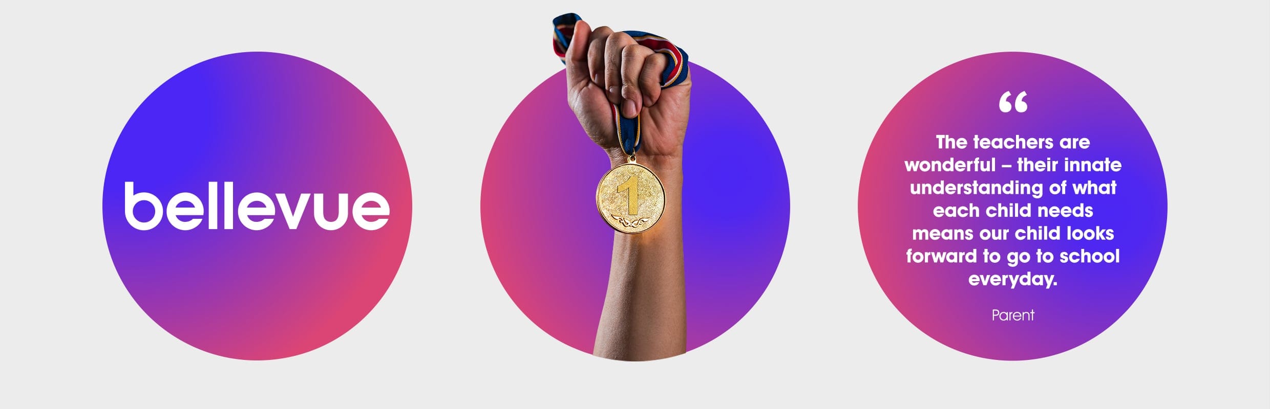
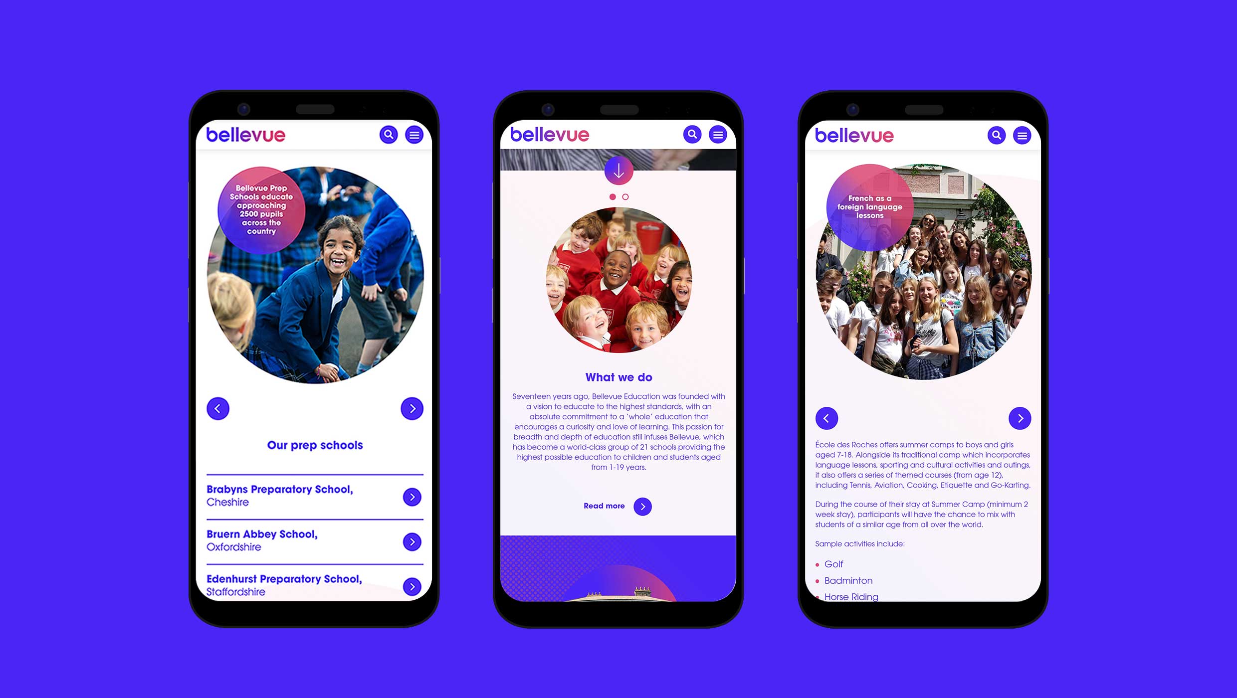
Bellevue is in the business of inspiring young people. In reinventing the brand, we knew from the outset that an evolution would not be enough. Everything from colours to logos and straplines was reimagined and redesigned to create an identity to reflect the brand today and propel it into the future.
A symbol of togetherness
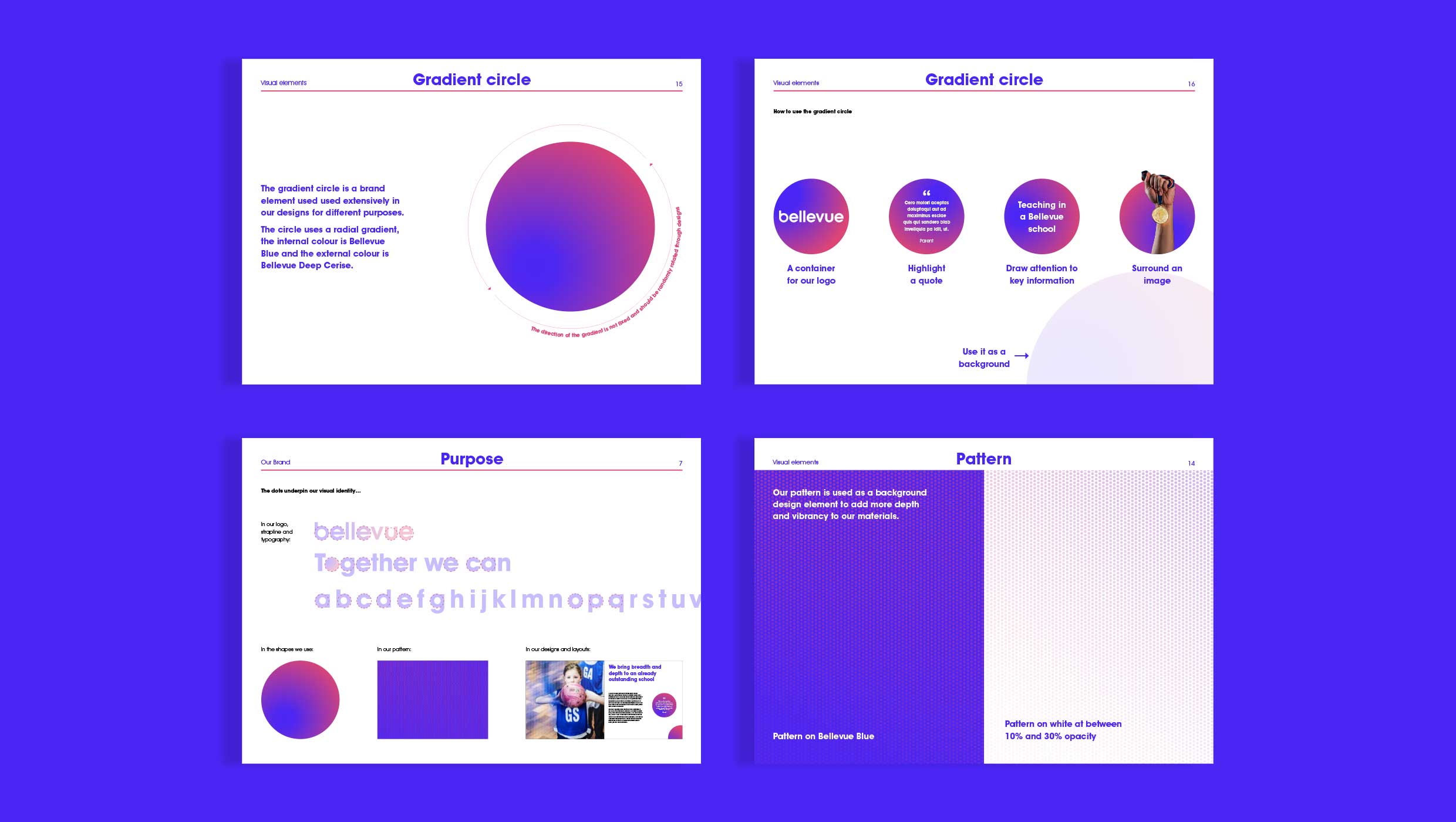
The dots, which are a thread throughout the new visual identity, symbolise the power and potential of working together. Each dot represents a member of the Bellevue community – children, teachers, support staff, parents – coming together to achieve more.