New visual identity for Farnborough Hill
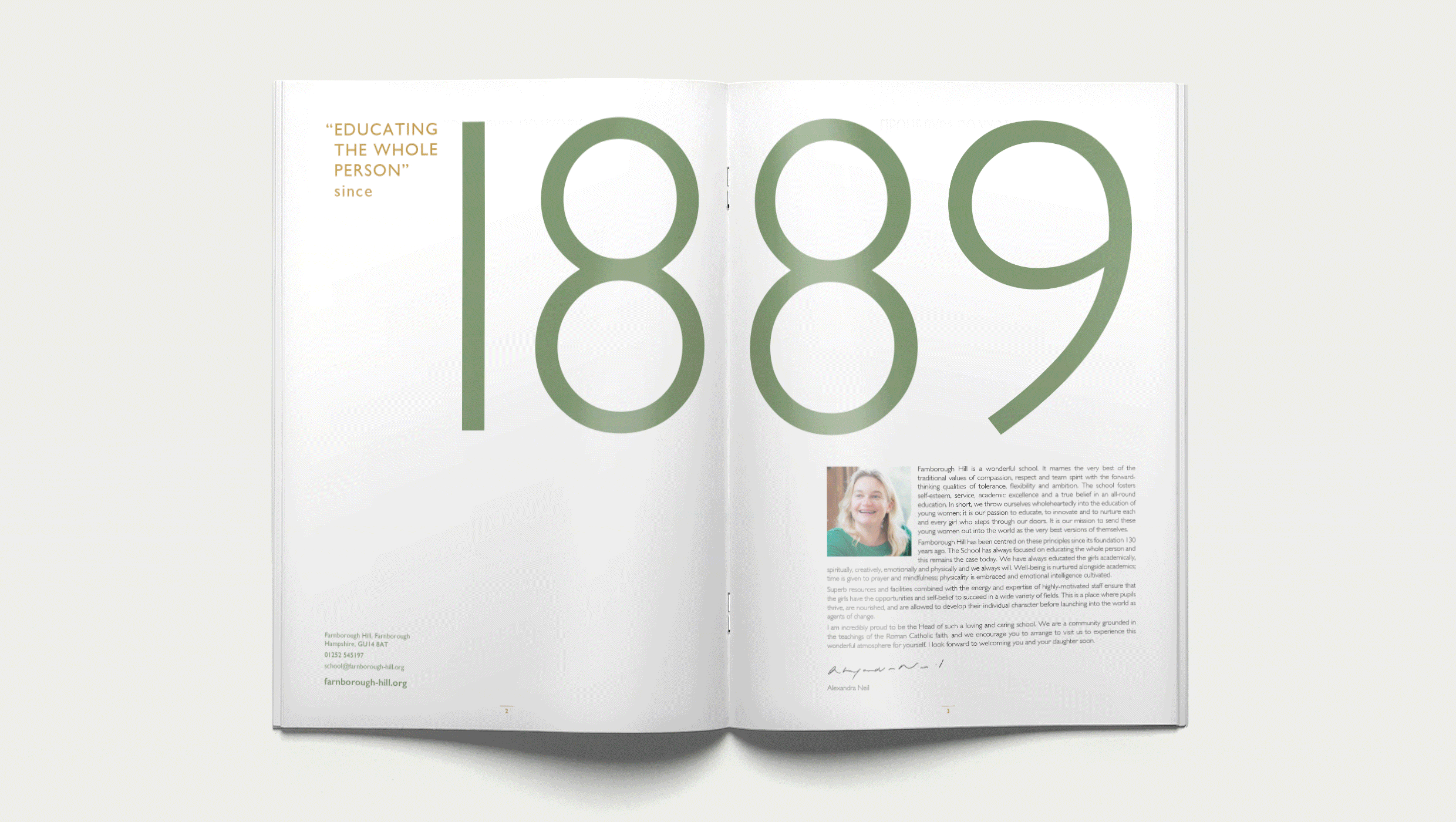
The starting point for the rebrand of Farnborough Hill was that it “remains a green school”, but that everything else was up for grabs. Even the shade of green changed dramatically in this root-and-branch review and reset of their brand to strategically position the school for the future.
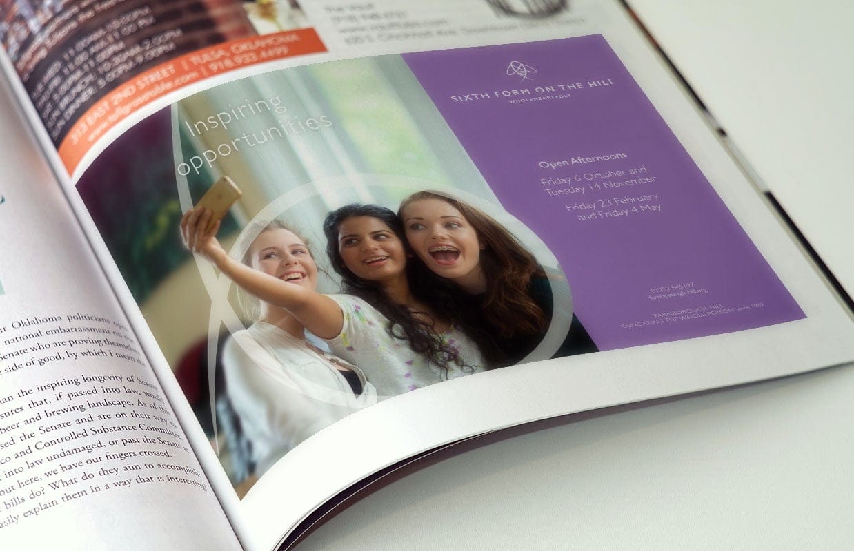
Wholeheartedly
Finding the school’s brand purpose was our initial focus. After digging deep through focus groups, archives and desk research we arrived at ‘Wholeheartedly’ – a single word that encapsulates the spirit and ethos of pupils, staff and alumnae – positioning the school as academically rigorous and reaffirming their reputation for outstanding pastoral care. From this foundation, the visual identity grew.

More than a logo
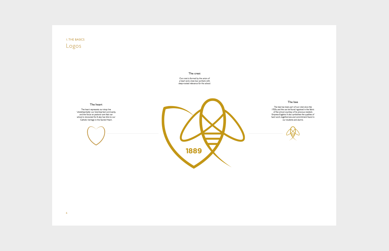
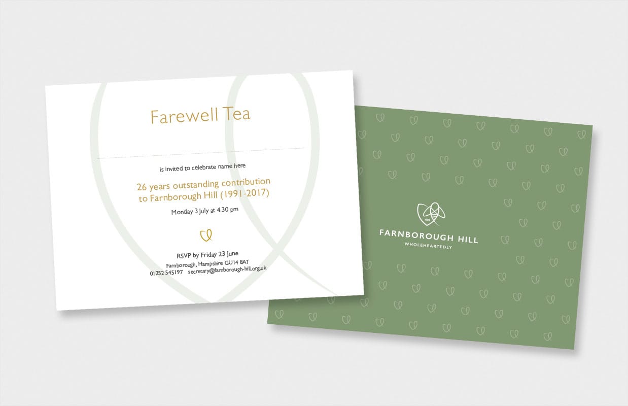
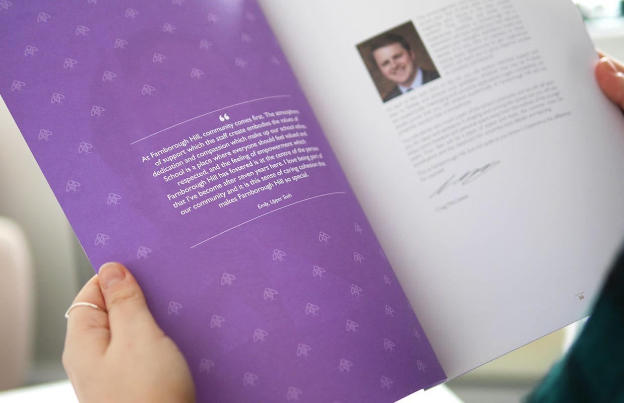
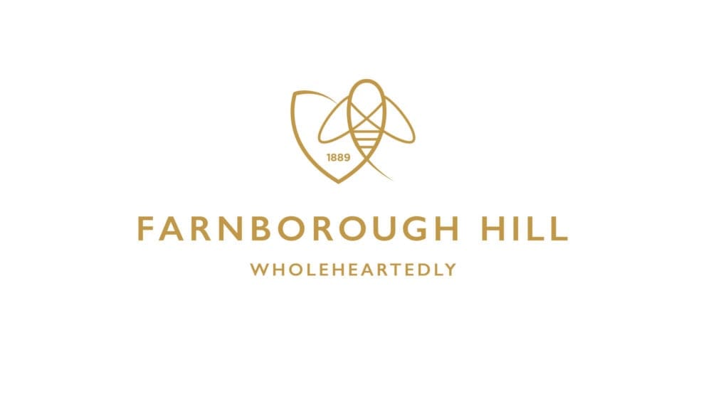
The new school logo was designed to bring together the strapline – represented by the heart – and an element of heritage in the bee which could be found in the old logo and is an emblem embedded in fireplaces, door handles and elsewhere in the fabric of the building. The role of the heart goes beyond the logo. It is a graphic element in its own right, used in imagery, patterns and icons to reenforce the wholehearted message.
“The brand has really distilled what’s important about the school and helps us to speak clearly about the vision and ethos.”
Clare Duffin, Director of Admissions, Farnborough Hill