New identity and campaign for Abingdon School
Struggling to stand out with an uninspiring brand, Abingdon School wanted to inject some life into their identity and campaigns. A bold and simple use of colour combined with a new narrative transformed the school’s marketing.

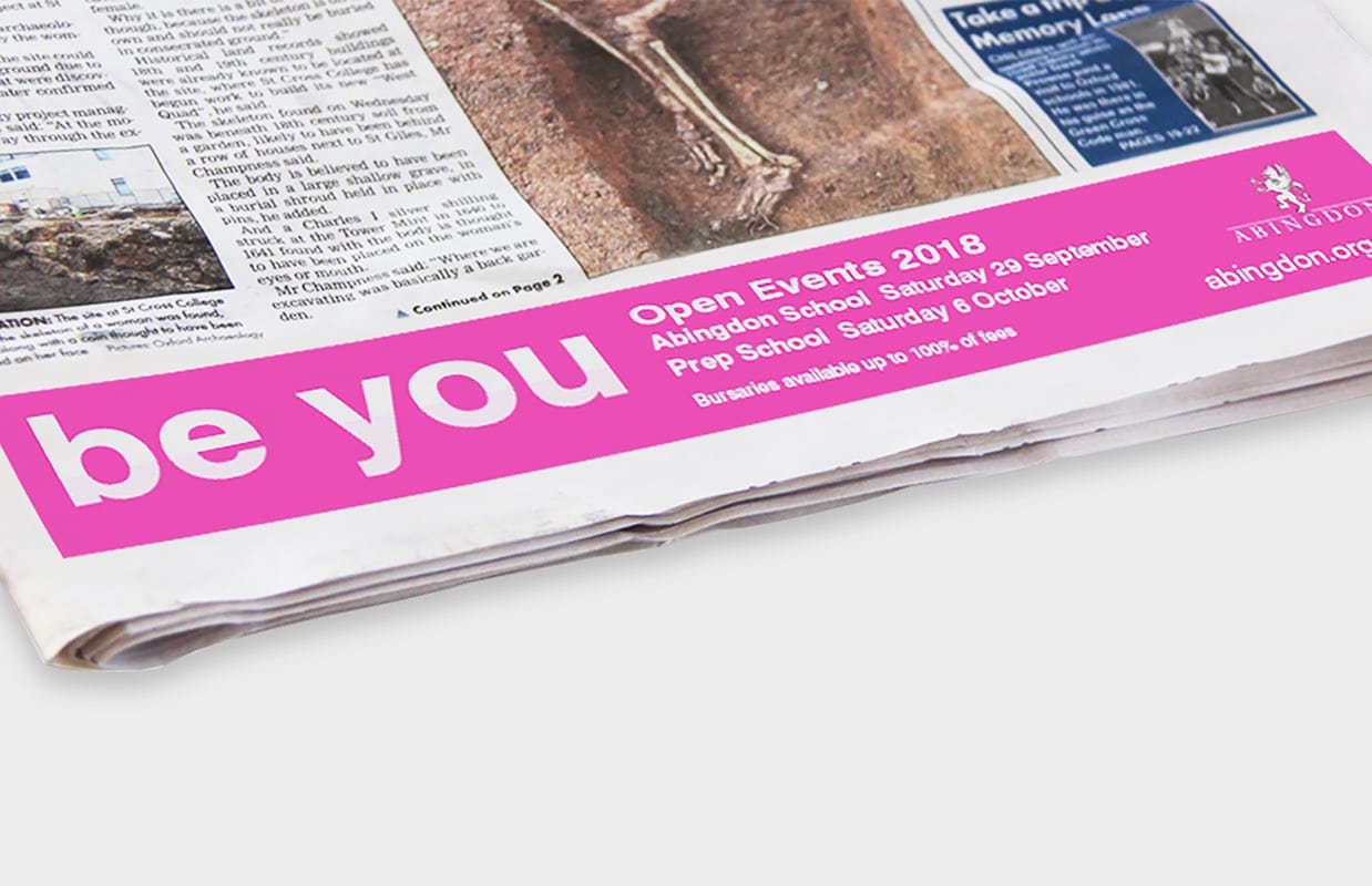
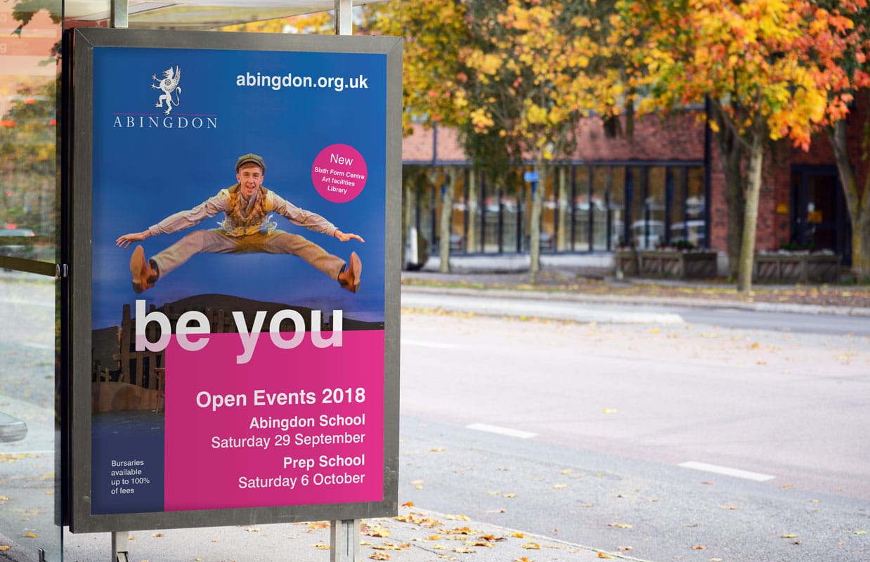
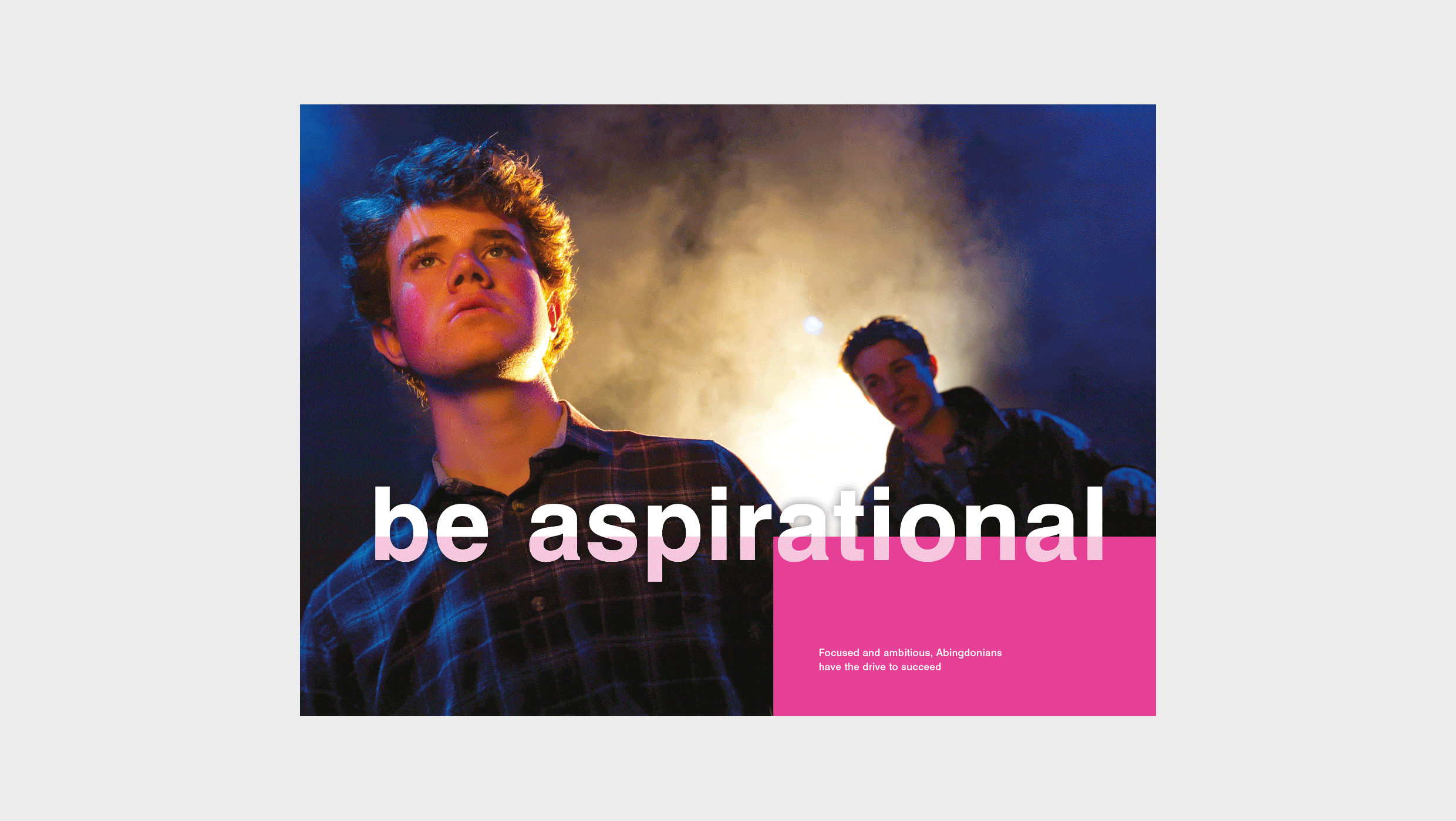
Be gutsy
The school’s new campaign narrative ‘be you’ has two purposes: it empowers students to try every opportunity that comes their way, and at the same time inspires them to be themselves. The narrative runs across digital and print campaigns, as well as prospectuses, website, banners, and environmental graphics around the school.
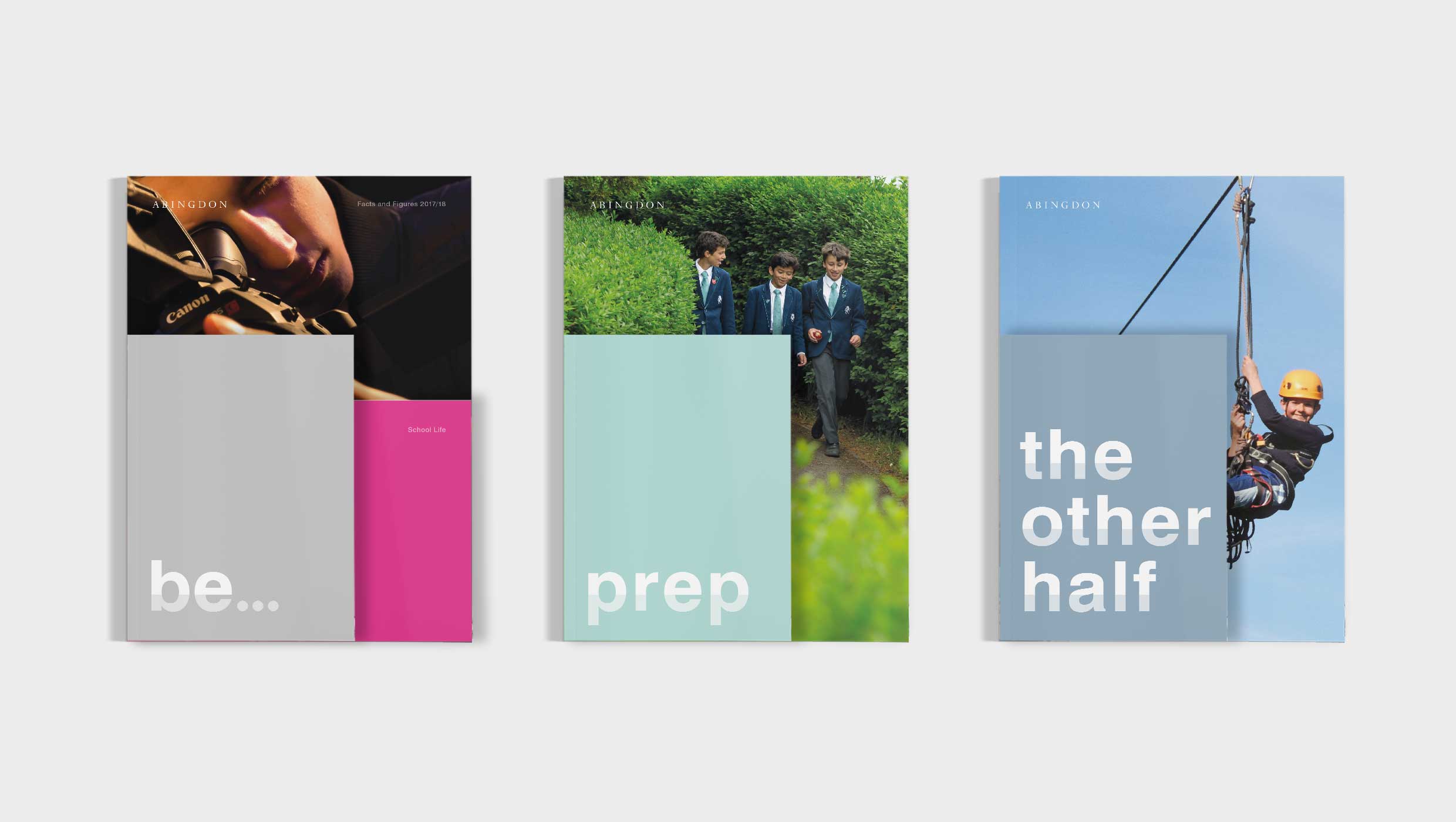
Going pink
The main colour used by the school before the rebrand was a muted blue. We were keen to demote this to a background colour and find a more dynamic palette to lead with. Through our research, we discovered that a bright pink used on some sports kits was worn with great pride by students. By combining this with a high contrast, a high impact palette emerged.