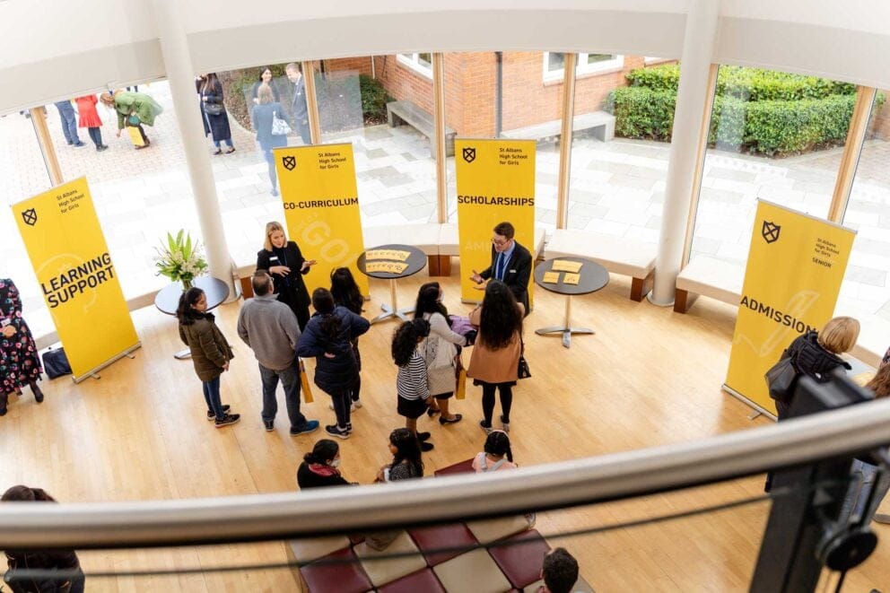
A word-centric brand for an independent girls school
Situated a few miles north of London, St Albans High School (STAHS) counts some of the best schools in the country as its neighbours. With the arrival of a new head, the school recognised the need to rejuvenate the school’s brand and present a confident alternative proposition to prospective families.
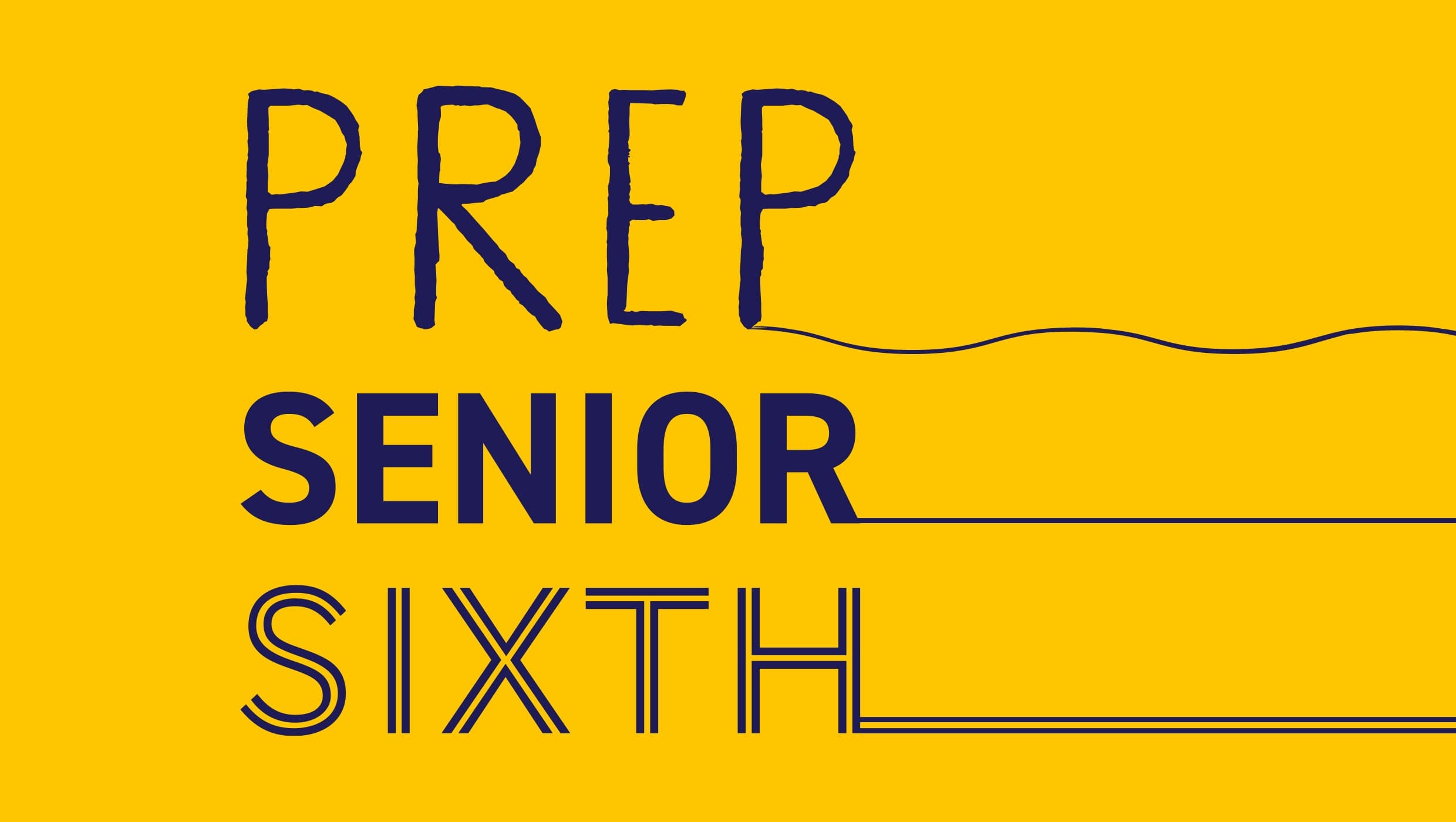
The power of words
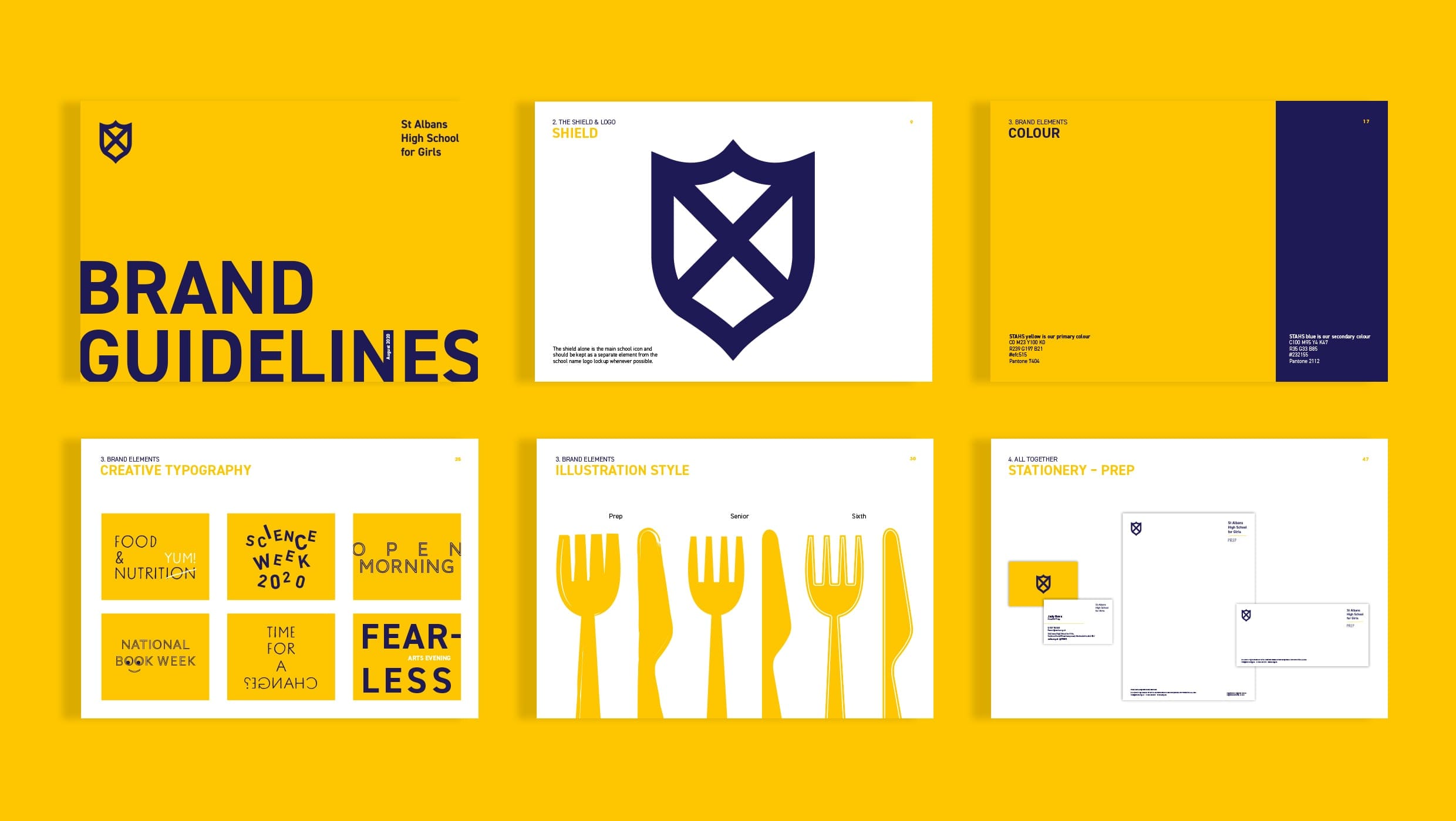
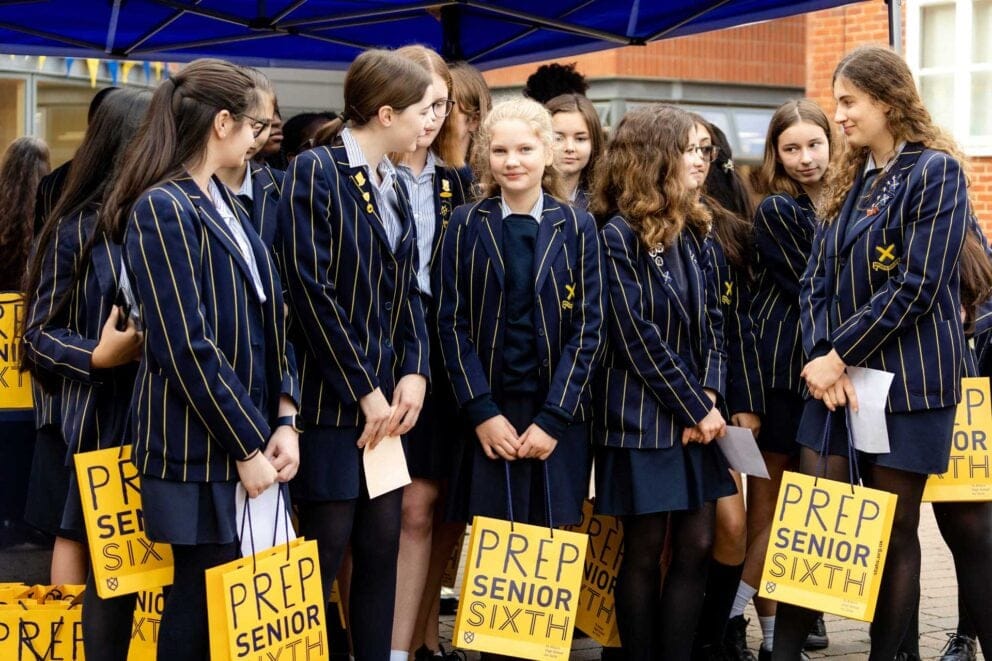
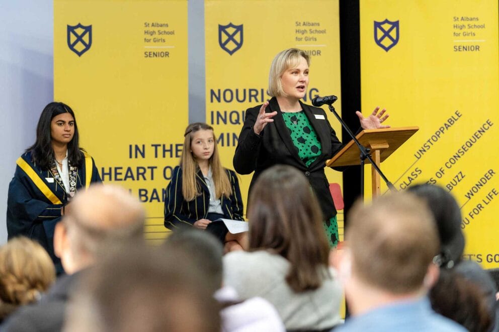
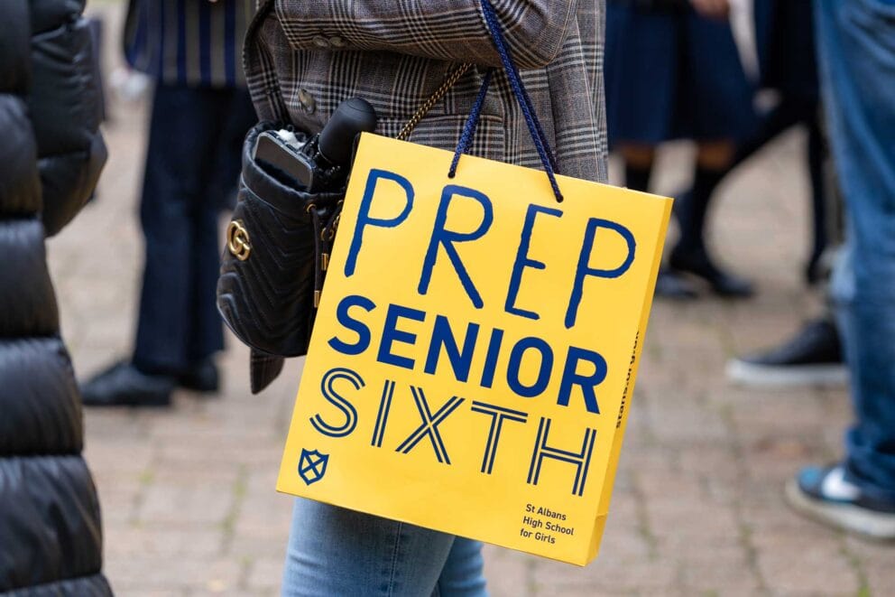
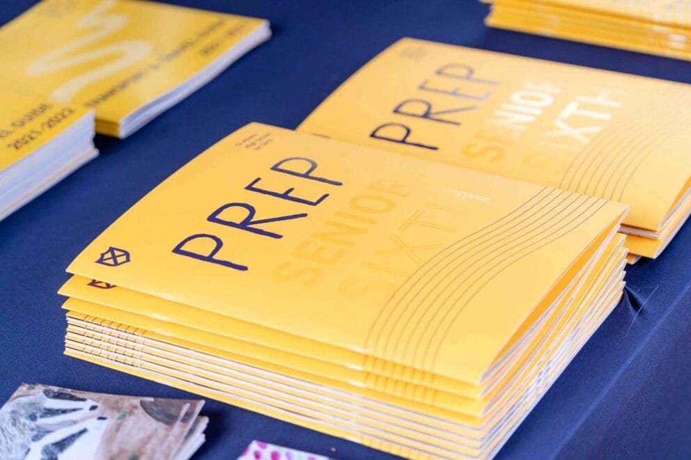
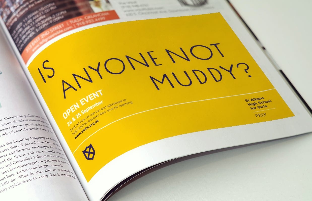
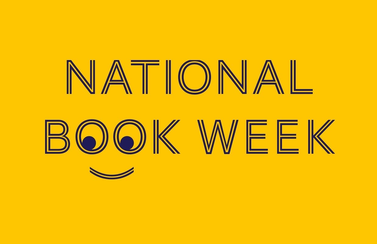
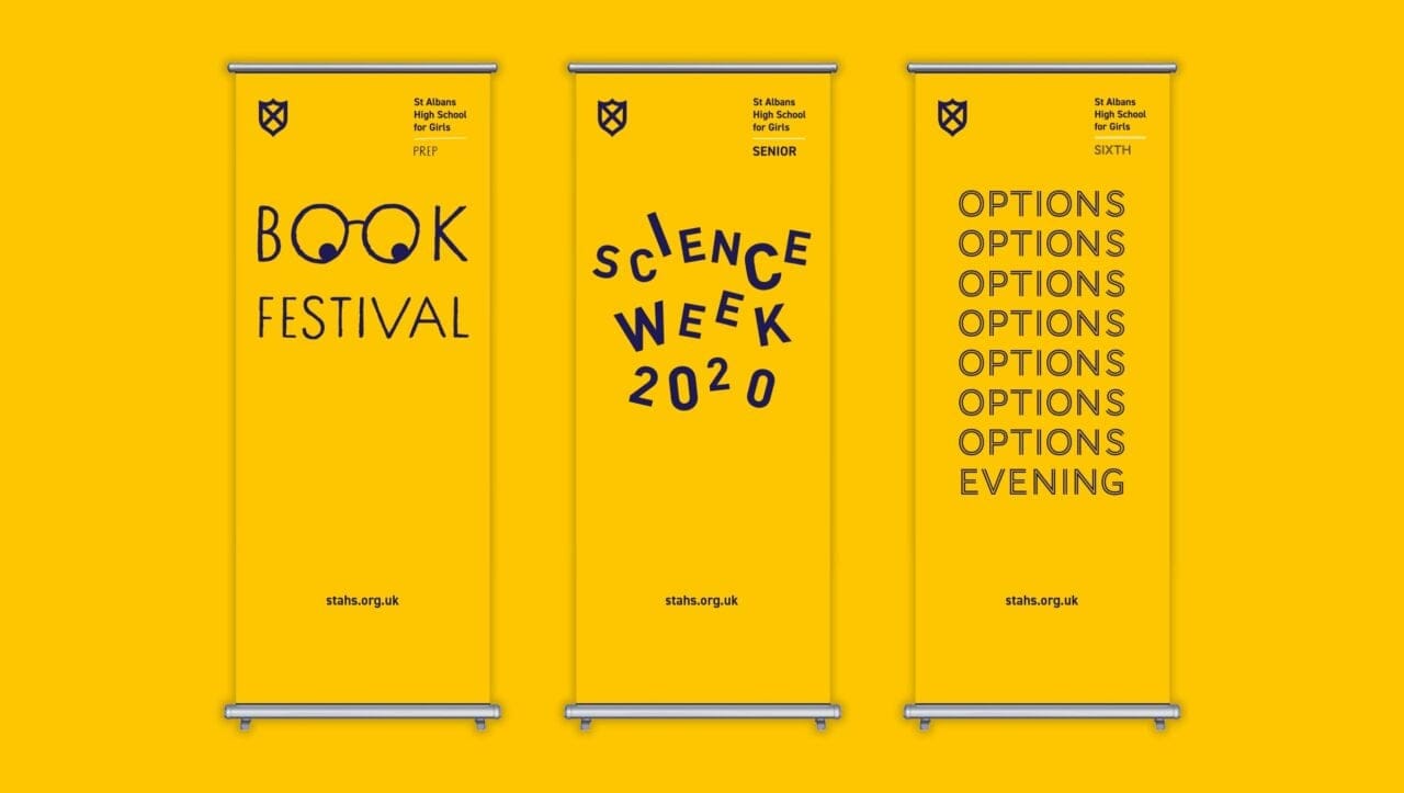
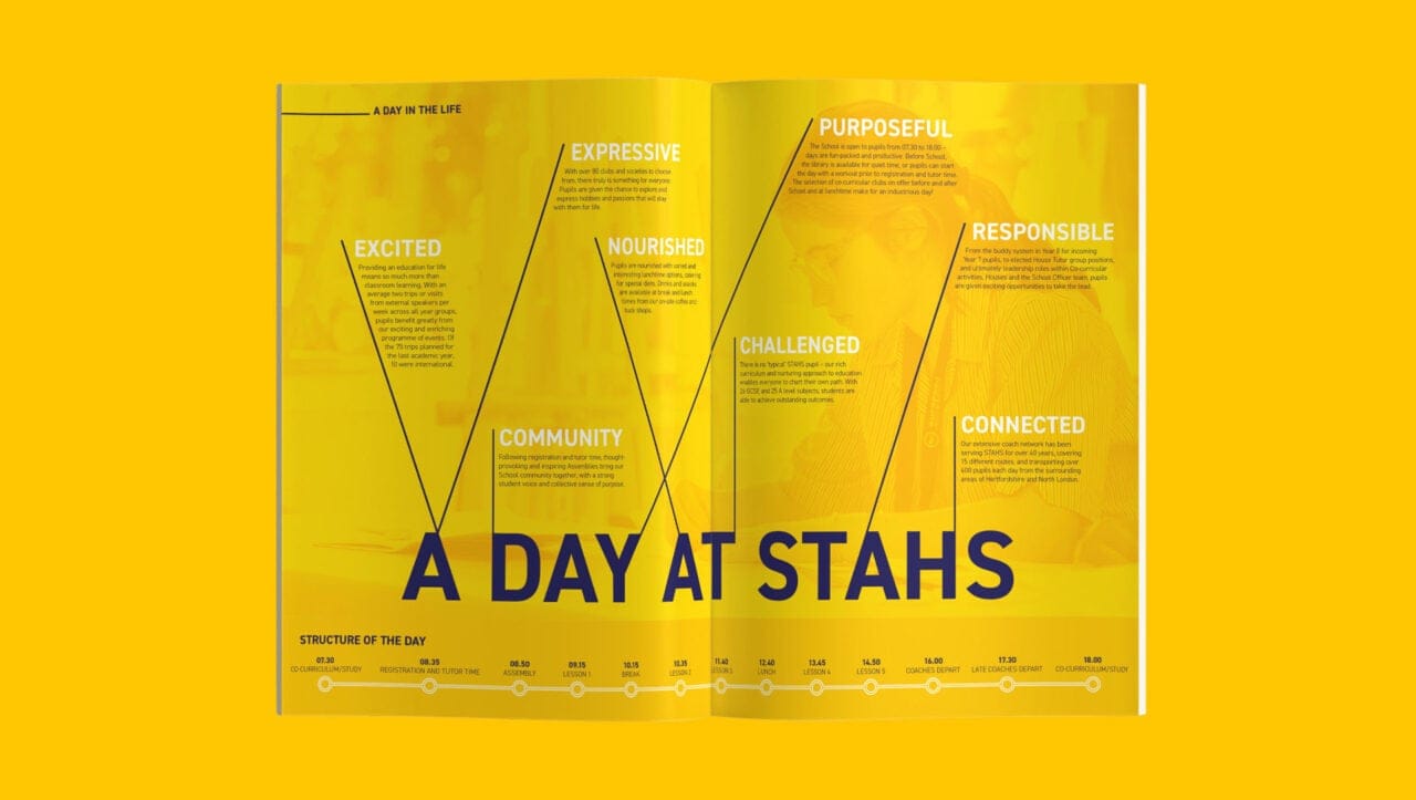
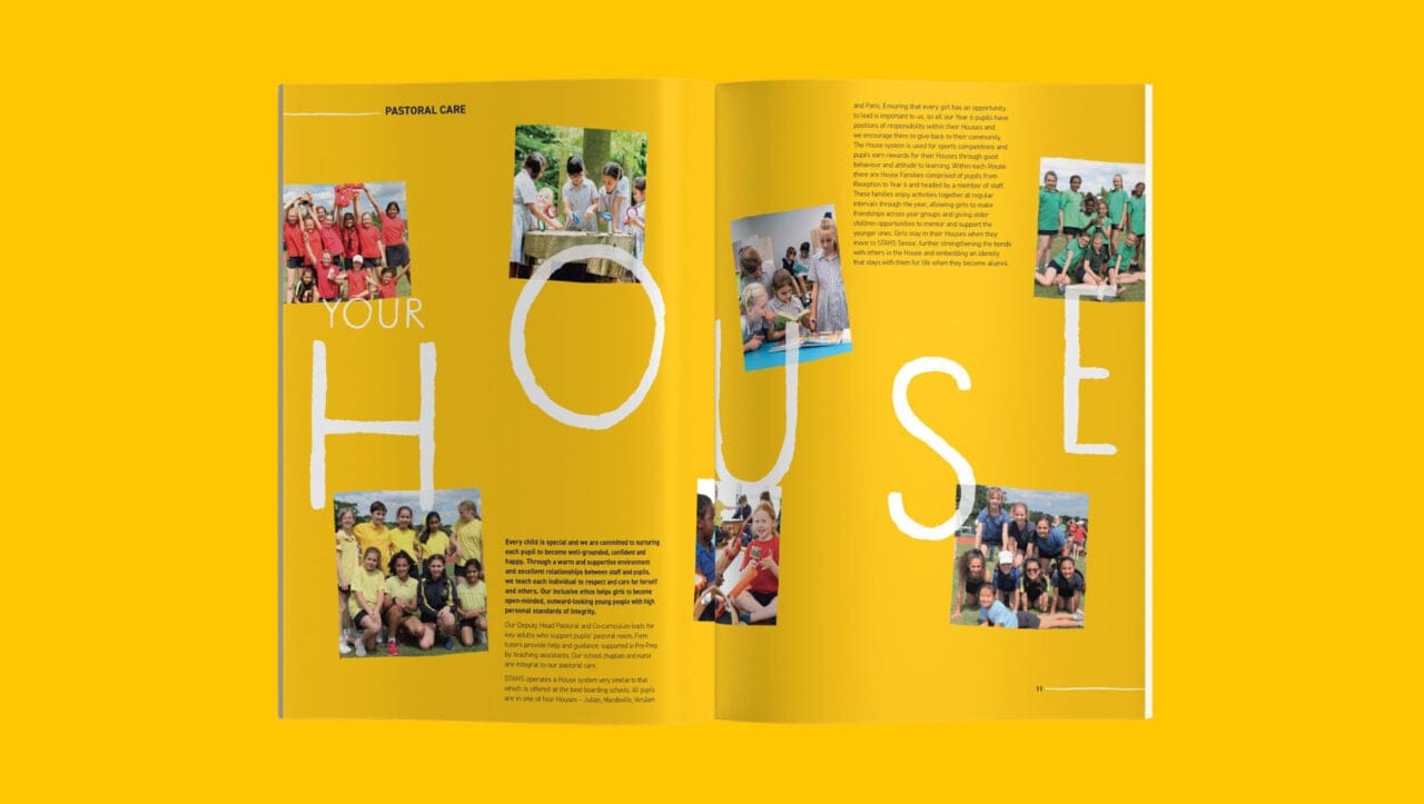
Breaking from traditional norms in the independent schools sector, the STAHS brand leads with words, not images. Creative copywriting and typography combine to convey the free-spirited, grounded nature of the school and grab attention. Prep, Senior and Sixth follow the same design principles, but maintain their own identity though the use of different fonts and line styles.

Going bold
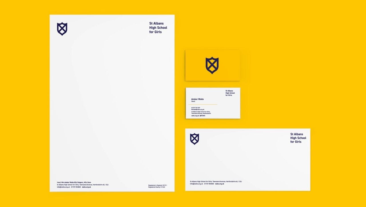
Around half of all independent schools have blue as their main brand colour, and this was the case for STAHS. We knew from the off that we wanted to create a more distinctive and ‘ownable’ palette for the school. We did this by flipping their colours, making the yellow accent (albeit a richer shade) their primary colour. The result is bold, fresh and memorable.

Keeping it simple
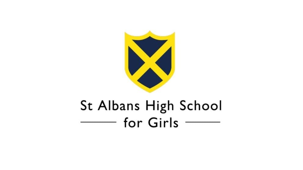
The school shield is an important link to the town of St Albans, a connection we didn’t want to lose, but we did want to create some separation. In redrawing it we aimed for simplicity–ensuring it works as well as an avatar as it does on the side of a minibus. We also wanted to give it character, moving away from the generic shield shape. The resulting shield is understated yet purposeful; a strong symbol that will serve the school well for many years.
“MCC understood my vision for the School and very deftly wove this into a brand which captures everything our pupils, parents and staff already knew and loved about the School, in such a way that it felt like an exciting development of something comfortable and familiar”
Amber Waite, Head, St Albans High School
