A brand identity for a London prep school, inspired by its surroundings
St Christopher’s is a girls prep school based in Hampstead, London. After a period of change the school recognised the need for a brand refresh to reflect their vision and build confidence in their community.
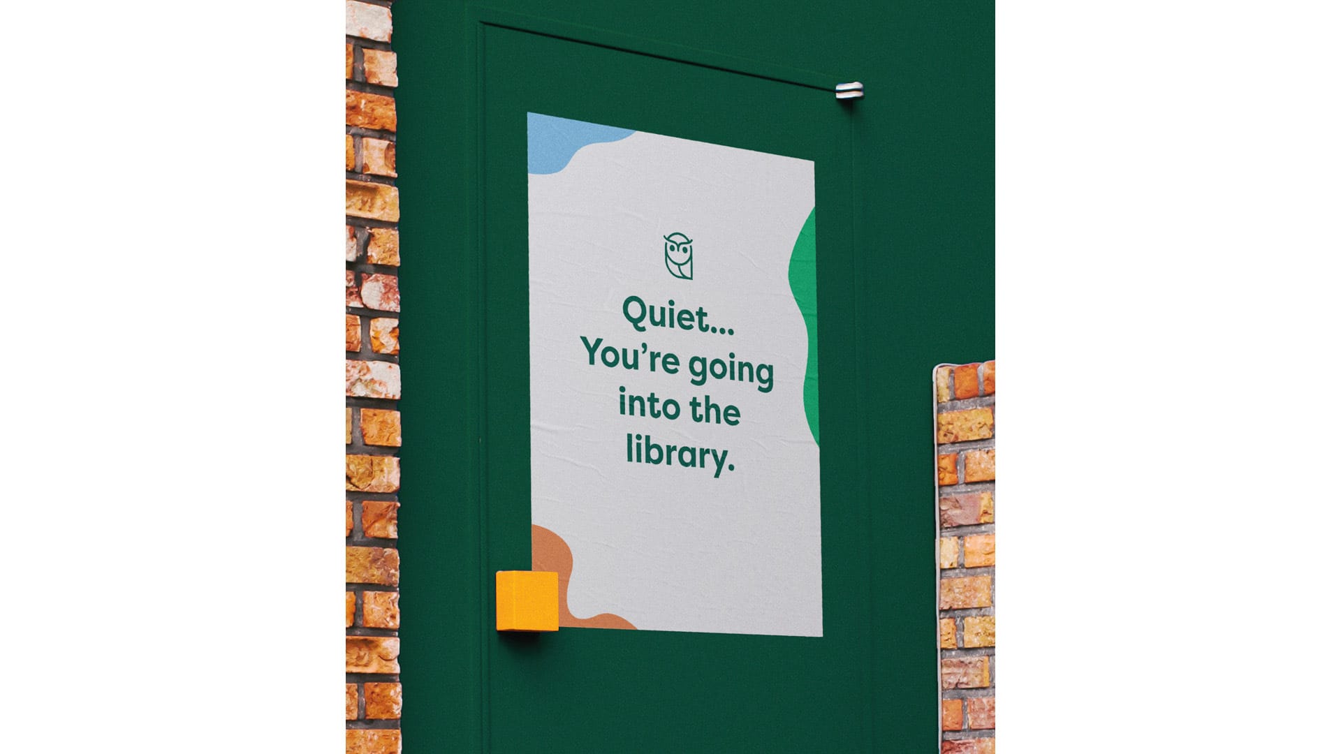
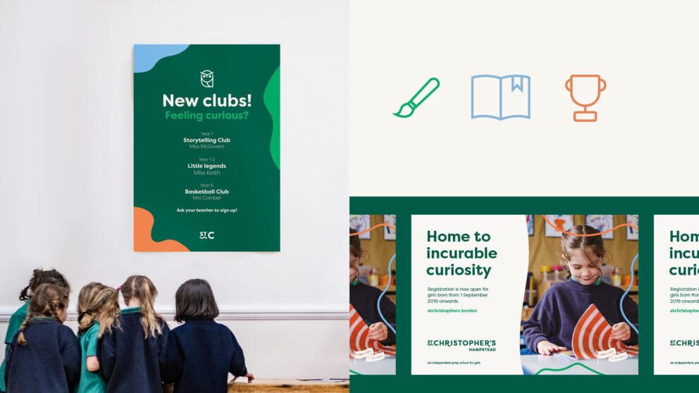
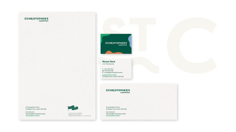
The school now has a comprehensive new identity including a new logo, strapline and colour palette – even the school’s mascot ‘Owlwyn’ makes an appearance in the brand.
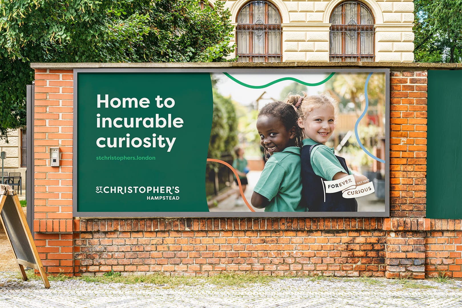
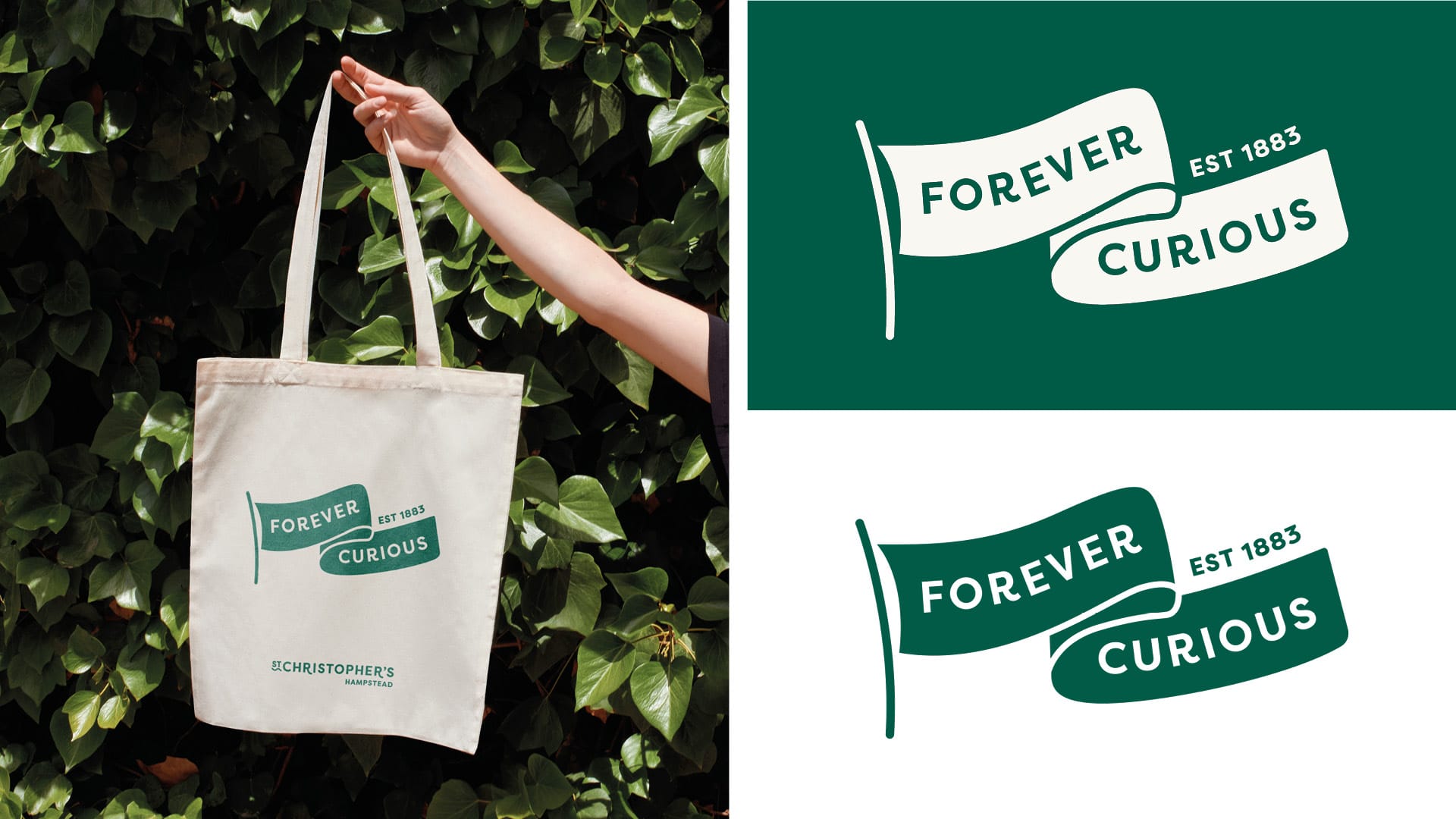
Curiosity; the thirst for knowledge and experience and the love of learning, is central to everything at St Christopher’s, and so ‘curiosity’ became the cornerstone for the brand’s visual identity, tone of voice, and the school’s entire ethos. The strap line ‘Forever curious’ encapsulates this, and also nods to the school’s history and founding, while the curious paths reflect the individual journeys the pupils take through the school.
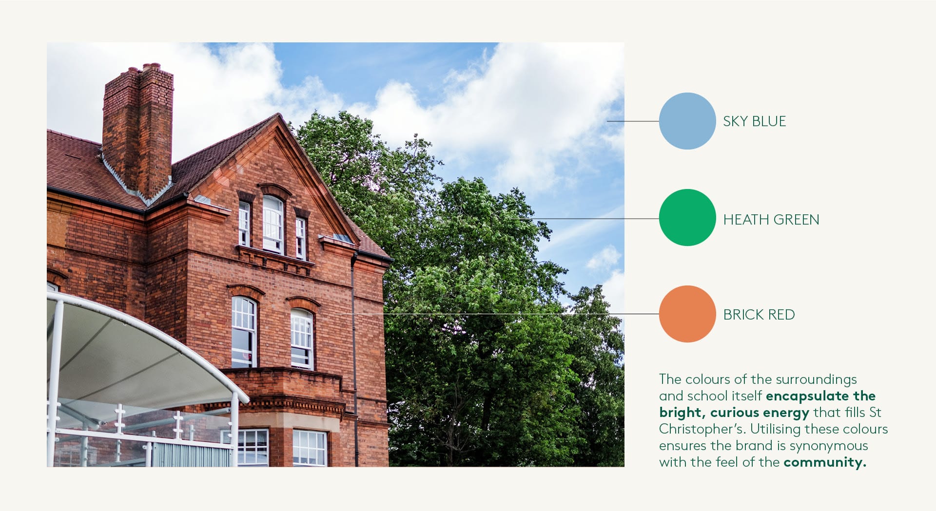
We expanded the school’s colour palette by introducing three accent colours – inspired by the school’s surroundings – bringing some much-needed vibrancy.
The existing rich forest green remained to give the brand some gravitas, and replacing white with a warm putty softened and modernised the look.
We created a new website from scratch – everything from the menu structure to the subtle movement of the waves was built around our ‘curious paths’ concept.
View the website here.

It soon became apparent that Owlwyn, a stuffed toy that lived in the Head’s office, was an integral part of life at the school, beloved by pupils and teachers alike. The Owlwyn icon became the school mascot: the friendly face and voice of St Christopher’s.

