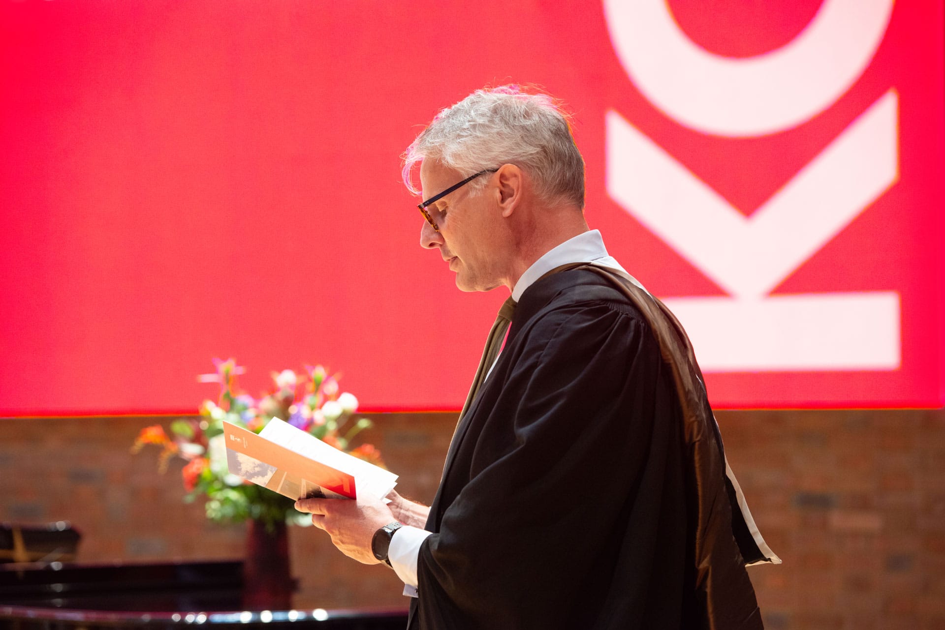
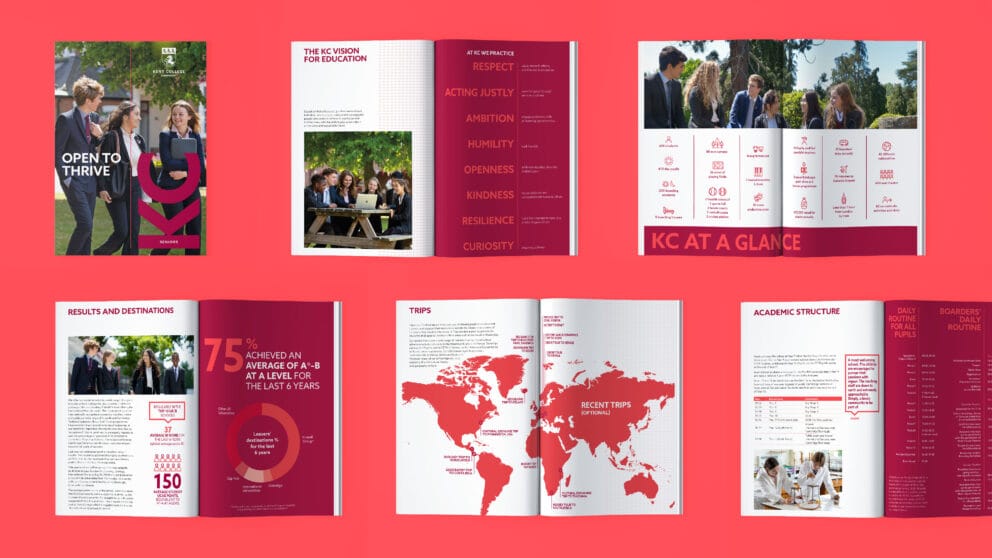
A confidence inspiring brand for an independent college
Kent College, Canterbury were struggling to stand out in a concentrated market with a conservative and lacklustre identity. We created a brand and messaging to reflect their progressive and open-minded ethos, and help restore a sense of pride in the school.

![]()
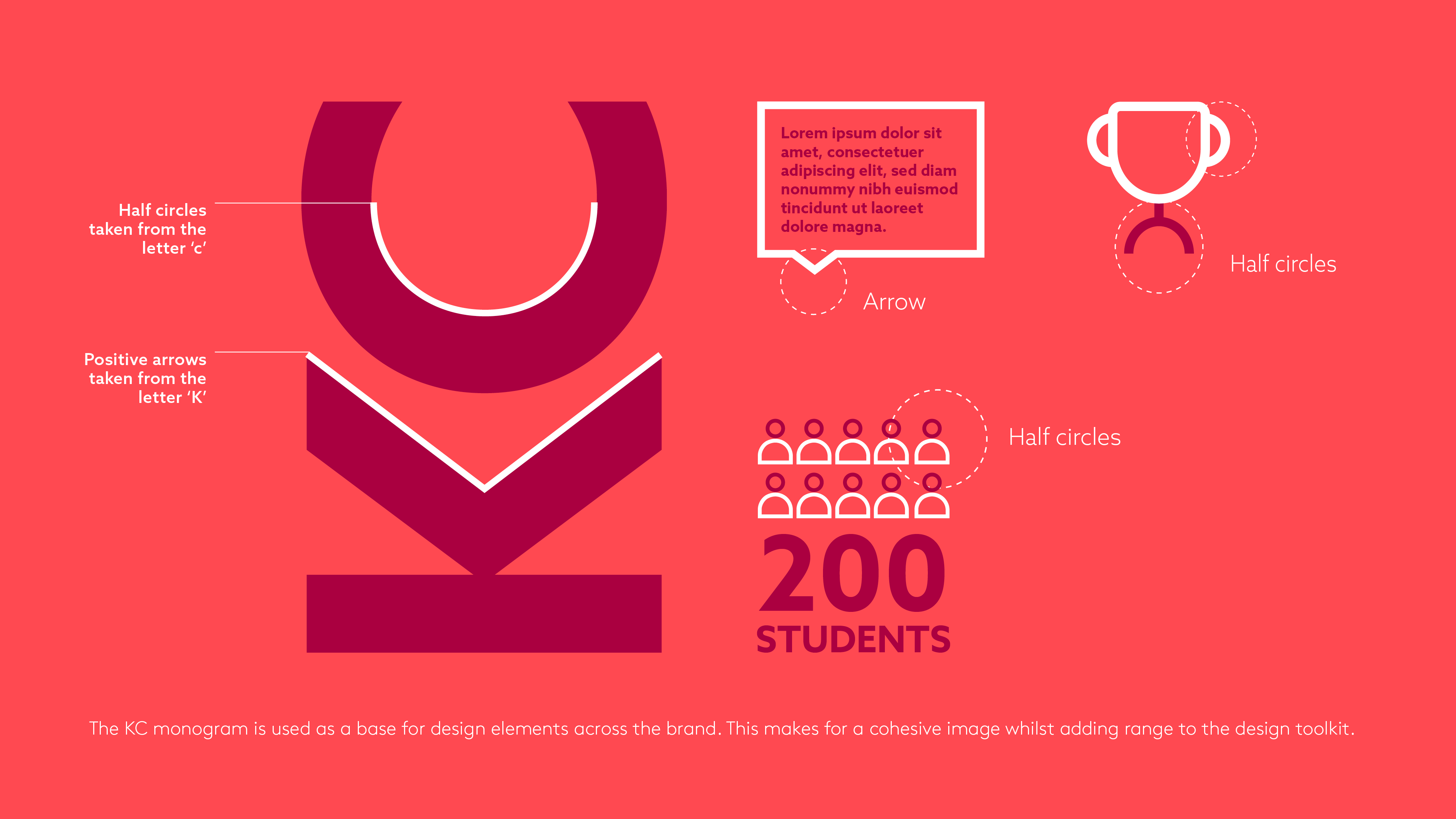
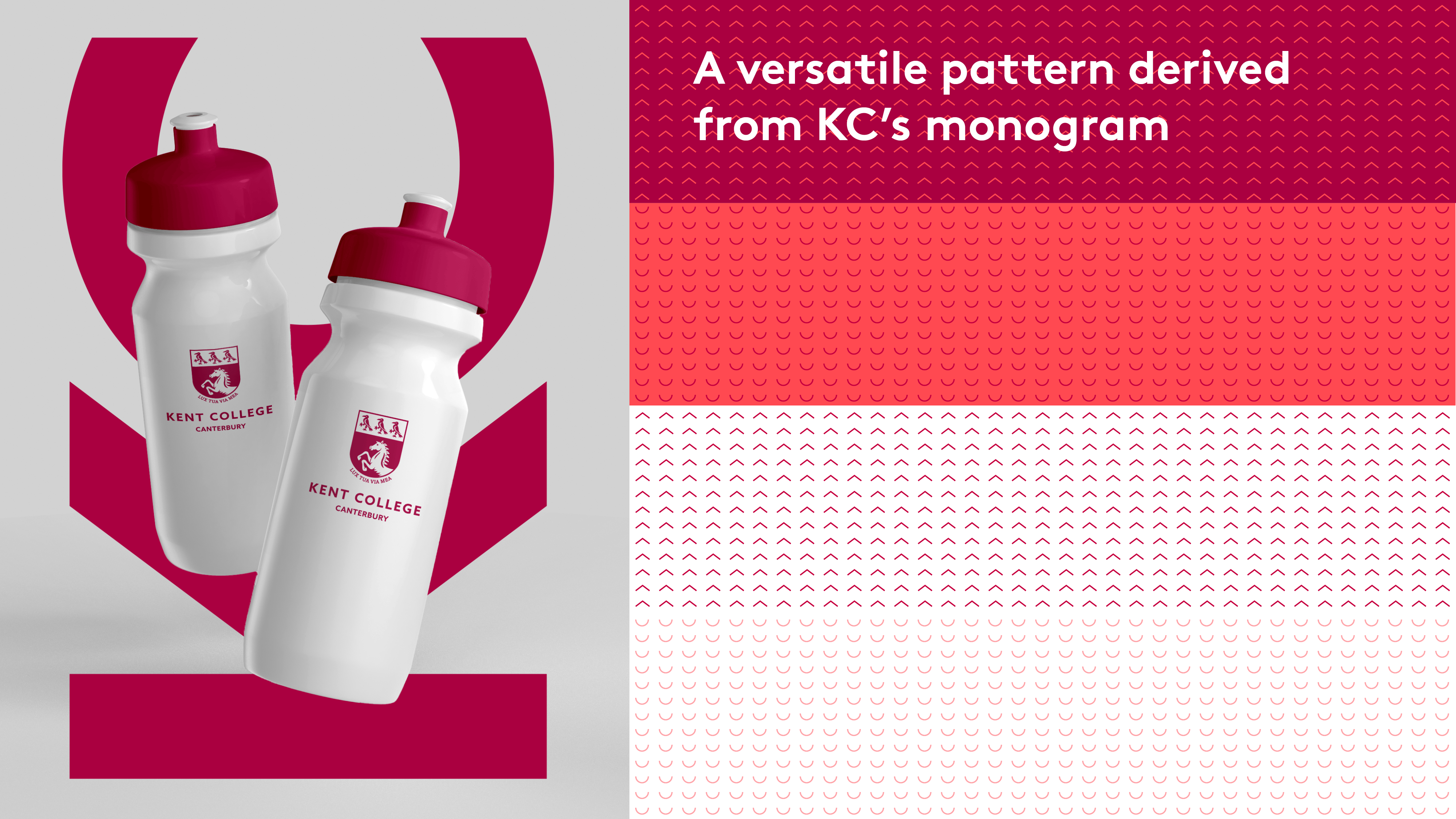
Less is more
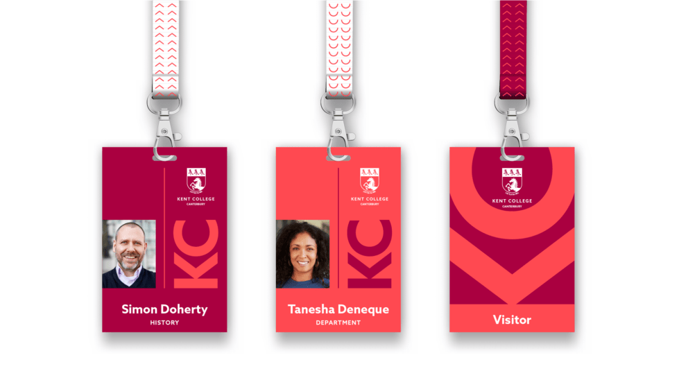
A key part of the rebrand was modernising the college’s crest. We simplified the design – removing fussy elements, adding a curve to the shield and making it one-colour – creating an adaptable symbol suitable for modern use, whilst maintaining a sense of the school’s heritage.

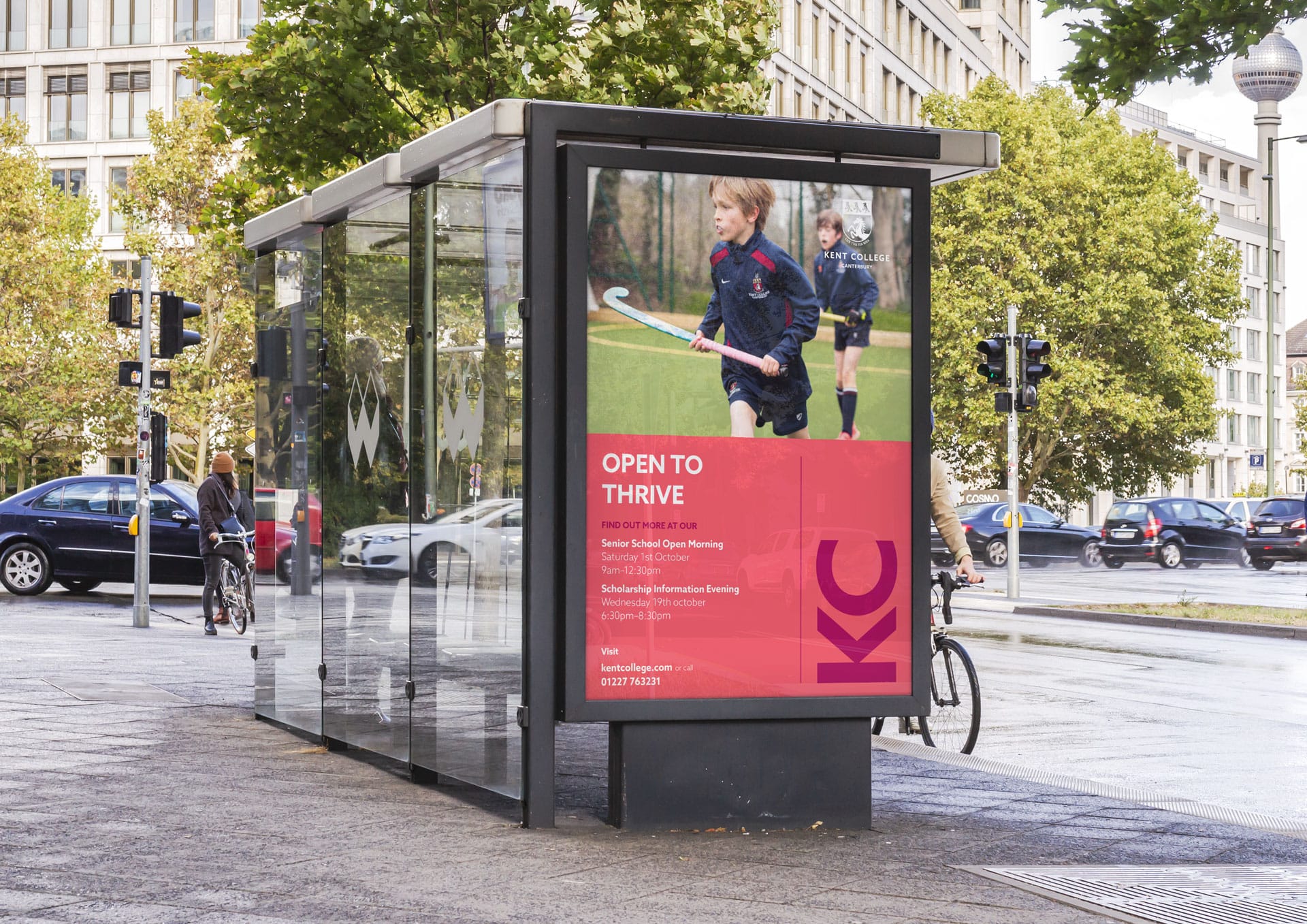
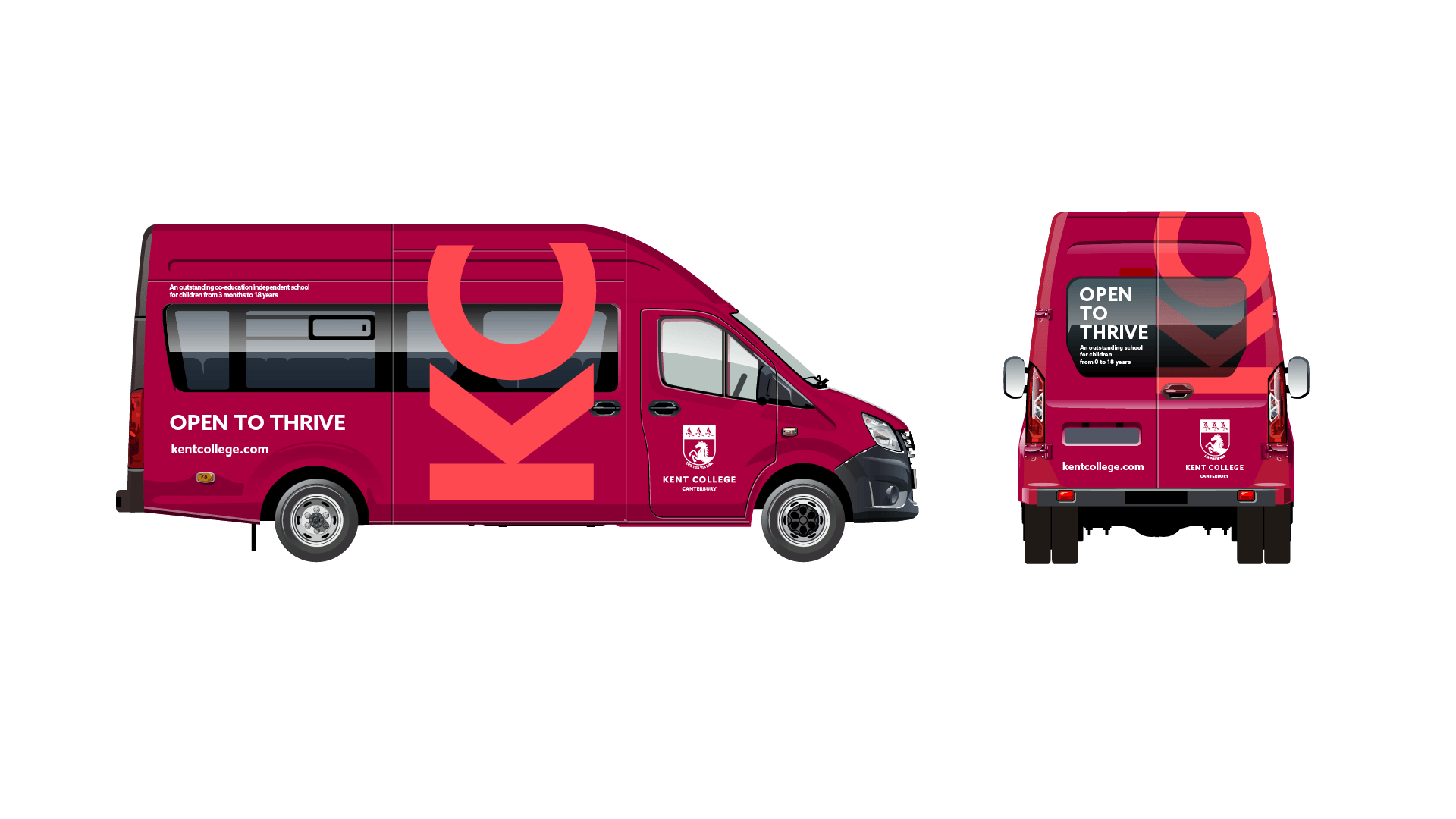
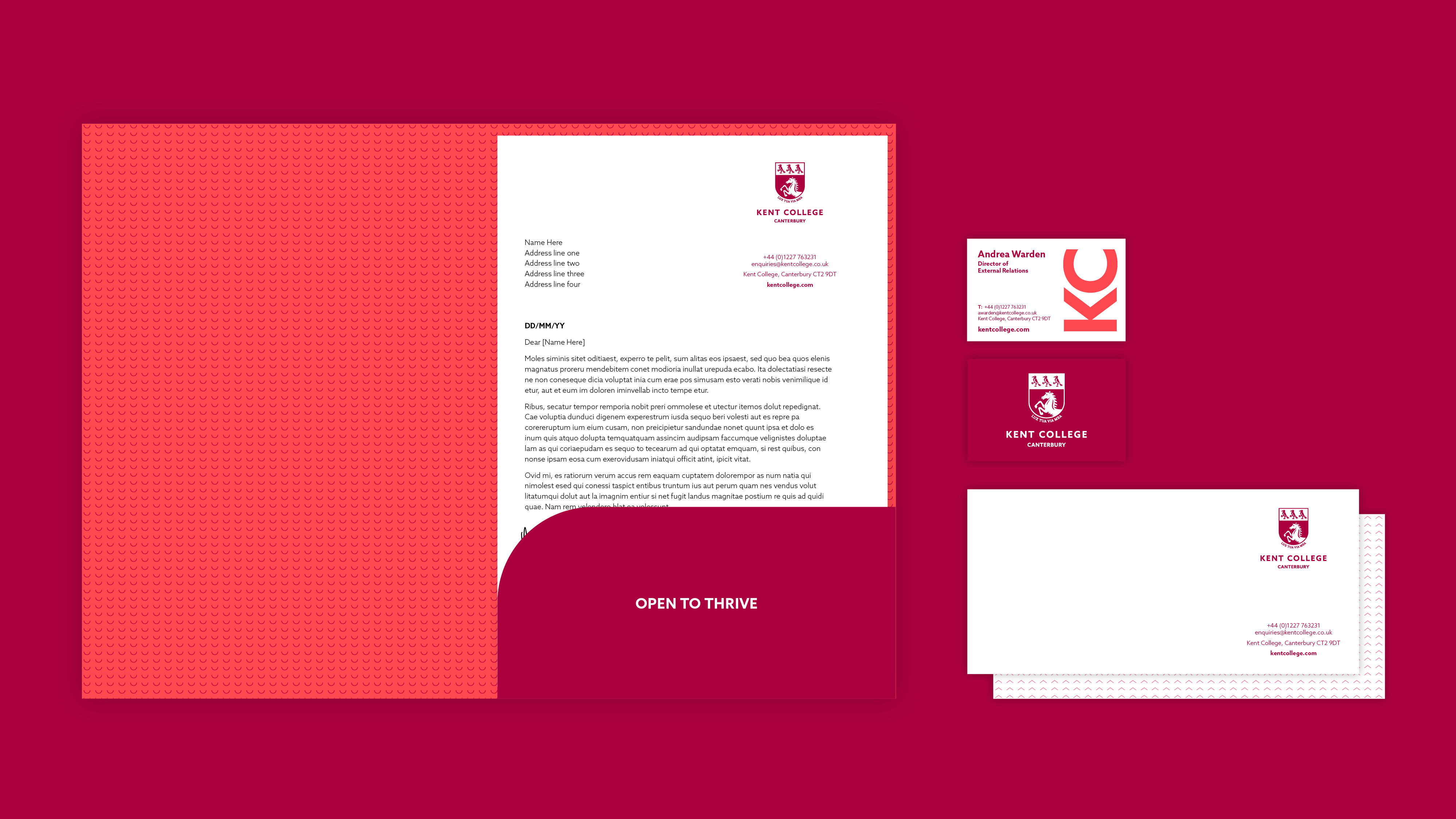
Open to thrive
Our tagline ‘open to thrive’ embodies the school’s openness to new ideas and innovations, as well as its welcoming and accepting culture.