Farnborough Hill undertook a root-and-branch review and reimagination of their brand in order to strategically position the school for the future.
We spoke to the Head and the Director of Admissions about the process and pitfalls, and their tips for other independent schools embarking on similar journeys.
About the school
Farnborough Hill is an independent day school for girls aged 11 to 18. Founded in 1889, it operates in a very competitive market with high performing colleges and grammar schools locally, in addition to a number of other independent schools.
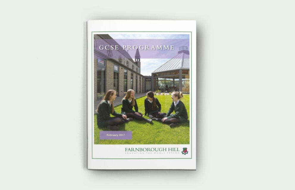
Aside from a few tweaks, the school’s crest had remained largely unchanged since the 1920’s. The school is well known for its pastoral excellence, but the brand needed to be updated to reflect the forward-thinking educational experience on offer, and strategically reposition the school as it looks to the future.
About the the interviewees
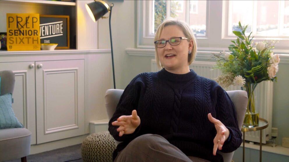
Alexandra Neil, Head:
Alex was appointed as Head in September 2016. Previous to this she was Deputy Head at Rye St Antony in Oxford.
Clare Duffin, Director of Admissions:
Clare leads the marketing and admissions teams and has been at Farnborough Hill for a number of years.
Q: Why did you decide that you needed to rebrand the school?
A: We had carried out lots of research among our stakeholders and this showed that there was a disconnect between what the school is actually like and the perception of feeder heads, prospective parents and girls. The brand was outdated and looked like any other school, leading to perceptions of the school being old-fashioned rather than illustrious. We needed something identifiable and simple that accurately reflected the modern Farnborough Hill. It was also apposite with a new Head, providing a new vision and relative objectivity.
Q: What involvement did the governors have?
A: Initially we gave a presentation to governors to raise awareness of marketing and suggest that this was an area for development. Then we held a strategy day at which a presentation was given about the value of branding. This was followed by a paper to governors to justify the expenditure.
Five governors were involved in the beauty parade to choose an agency which meant that they had buy in from the start. We had the support of a marketing governor who was fully behind a radical change. The branding sub-committee included a governor who had full involvement in the process. This meant that when the solution was presented to the whole board it was presented as a final solution, not something to be tweaked. Communication at every stage was very important to keep everyone in the loop and get everyone’s buy in; for them to see that it’s a positive idea.
Q: Did you have a vision for what you wanted?
A: Requirements were articulated in the brief: it needed to be forward-thinking, innovative, impactful and accurately reflect ethos and convey aspiration. Clare wanted the bee from the former crest to be used; Alex had a totally open mind.
Q: What was the biggest challenge and how did you overcome it?
A: Getting people on board – ie getting stakeholders’ buy in. This was about taking on something that was seen as sacred; nostalgia of yesteryear. We had to work hard to make sure that everyone understood the message and knew that we had a really considered, well-thought-out plan for the release of the brand.
“This was about taking on something that was seen as sacred; nostalgia of yesteryear.”
Q: What was the process like?
A: A bit of a rollercoaster – challenging, exciting, enjoyable, frustrating at times. We think we were very courageous going ahead with the rebrand, given the time and patience required.
Q: What was the most exciting moment in the project?
Clare – the day we spent at MCC when the first designs were revealed.
Alex – definitely seeing the brand come to fruition.
Q: Did anything surprise you along the way?
Clare – MCC’s adoption of ‘wholeheartedly’, which was a word we had been using unconsciously for years without much thought. It so perfectly encapsulates the essence of Farnborough Hill.
Alex – I was pleasantly surprised by some of the girls’ and staff’s reactions: some people had warned us off attempting this. Although not surprising, it was gratifying to have the leading Sisters’ support, endorsement and braveness. They thought that everything should be up for grabs!
Q: What inspired the new brand?
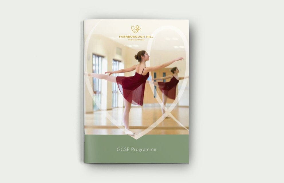
A: The project was very much about evolution, not revolution. We took the ‘bee’ and green palette from the current crest, as these were the best and most symbolic aspects of the brand. This allowed us to stay true to our legacy and better reflect the vision of the School’s founder.
Q: How did you involve the school community?
A: It was a parental survey that first flagged up issues of inconsistency with the brand and the uniform. We then held a whole school survey and MCC interviewed a number of girls and staff in focus groups in order to distil the essence of Farnborough Hill.
The Junior Leadership Team were shown the initial designs and asked for their opinion. Prior to release of the brand a presentation was made to all staff so that they understood the rationale for it. The girls were given a presentation in assembly before the letter went out to parents. This was all done in the term before public release. Once released all staff were given a goody bag of marketing material.
Q: What has the reaction been from the school community?
A: Quite mixed, which is to be expected. The Senior Leadership Team and governors love it, and staff are mostly happy – lots are even carrying their branded bags! We have also had some very positive comments from feeder school heads, parents and prospective parents. However, you can’t expect to please everyone: some Old Girls didn’t take on board the rationale for the change and did not want us tinkering with their school. Although the younger girls are largely indifferent, some of the older girls did not want change and have not fully embraced it.
Q: How do you think the new brand will affect marketing and recruitment?
A: Most importantly there is internal clarity of purpose, which has increased pride among staff. The girls have, albeit ironically, adopted the word ‘wholeheartedly’! All this will spread word of mouth.
Q: What would be your top tips for other schools embarking on a branding project?
Make sure that you have clear goals at the outset
Identify all the objectives in the brief document
Choose a variety of people across a broad spectrum of business disciplines for the sub-committee (should ideally be four or five people)
Pick off certain key people and groups and share the brand with them first, then introduce the brand to staff during a branding day well in advance of the official release (we did it half a term before); it ensures support and understanding from within and shows trust
Plan a coherent online campaign; do not let the new brand be a shock. There needs to be clear and well-thought-out communication with all stakeholders
Double the cost allowance for brand collateral
Start earlier than you think you need to and have a detailed timeline for all items that need changing: you would not believe how much there is to do and this prevents rushing and forgetting something
If you’re planning to change the uniform, change the branding beforehand to modify the impact
Anticipate criticism. Some people will never be won over by the new brand, and that’s ok, as long as you know it is the best reflection of the school
Check that the font is standard and, if not, make sure that you have the budget to buy the font for all your computers
If the new design involves solid blocks of colour check that your internal printers can cope with the new colour
Q: What would you have done better / differently?
A: Involved certain key people earlier. For instance, we decided to drop the .uk from the web address and email. This has caused some headaches for the IT department, which would have been avoided had we included them earlier. The admin staff also should have been more involved in the implementation of templates for letters etc. before brand release.
Worked more closely with suppliers and printers etc. You should ask suppliers for samples/proofs of everything. For instance, the signage around the grounds looked fine on paper but cannot be seen from a distance; and we’re having to redo staff badges as the text is too small.
Q: What are you most pleased with in your new brand?
A: The fresh combination of heritage and modernity. It has really distilled what’s important about the school and helps us to speak clearly about the vision and ethos.

