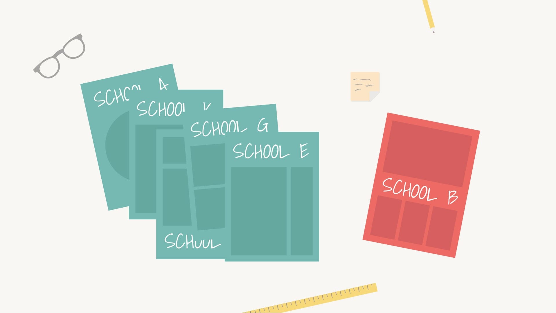
In our survey of the 500 largest independent schools in the UK we studied the hues, shades, pigments and tints that form the visual landscape of our sector.
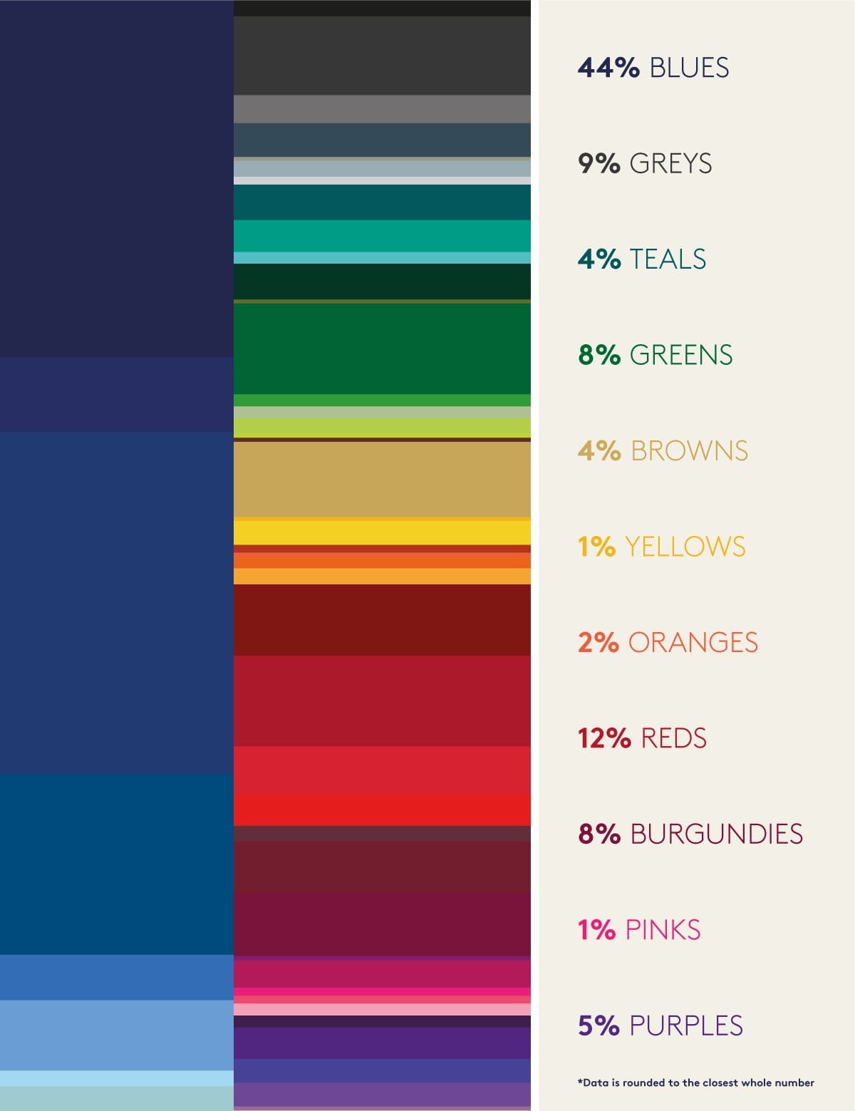
Strawberry, plum, coral, lime, sage, duck egg, gold – as you’ll see, we’re not short on variety, but with a prevalence of subdued blues it’s not surprising to see many schools use a secondary palette to add some vibrancy to their brand.
Navy is predictably the most seen shade in both co-educational and boys schools, with ocean blue (just a couple of shades lighter) most seen in girls’ schools. Gold is the most used accent colour – especially amongst prep schools – followed by orange and yellow tones. Explore the graphic and data to find out just how common your school colours are.
If you’re bored of your colour palette [read this article] you’re certainly not alone, but the most important thing to know is that your visual identity is not defined by your colours. Navy can be dynamic, burgundy can scream progressiveness, and fuchsia can be sophisticated – it’s how you use your palette that counts. There really is no such thing as a boring colour.
The data
The graphic below shows the most commonly used primary colours in the UK’s 500 largest independent schools.
Colour key
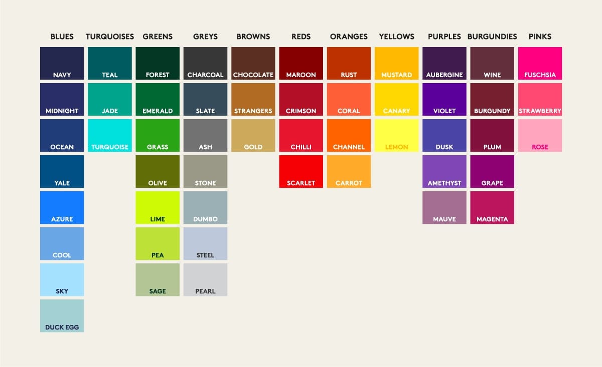
71 Navy
68 Ocean
36 Yale
23 Crimson
23 Emerald
20 Charcoal
19 Gold
18 Maroon
16 Plum
15 Midnight
14 Burgundy
14 Cool
11 Chilli
9 Azure
9 Forest
9 Slate
9 Teal
8 Jade
8 Scarlet
8 Violet
7 Ash
7 Magenta
6 Amethyst
6 Canary
6 Dusk
5 Duck egg
4 Black
4 Carrot
4 Dumbo
4 Sky
4 Wine
3 Aubergine
3 Channel
3 Rose
3 Sage
3 Turquoise
2 Fuchsia
2 Grass
2 Pea
2 Pearl
2 Rust
2 Strawberry
1 Chocolate
1 Coral
1 Grape
1 Lime
1 Mauve
1 Mustard
1 Olive
1 Stone